
Waffle Chart is live on the Tableau Exchange

Transform complexity into clarity.

Viz extensions, training, and consulting to get the most out of Tableau.

DATAVIZ

Tableau Extensions
Custom Widgets
Dashboard Design
UX/UI Expert
Tableau Cloud
Desktop
Learn
Viz
Filter
DATEPART('year', [Date])
{FIXED [Region]: SUM([Sales])}

Extensions

Clear visualizations, with minimal effort.

by data analysts, for data analysis
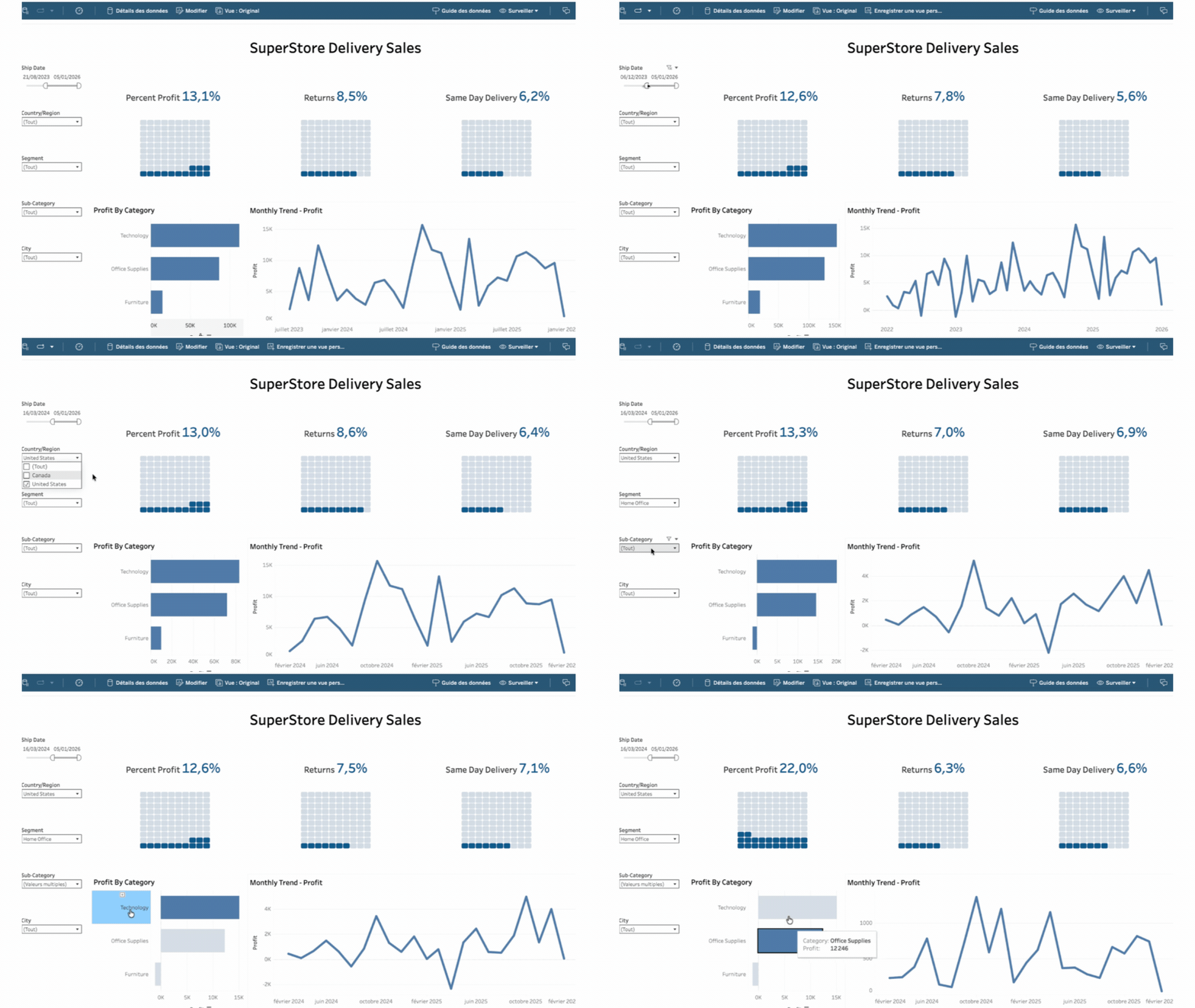
Waffle Chart
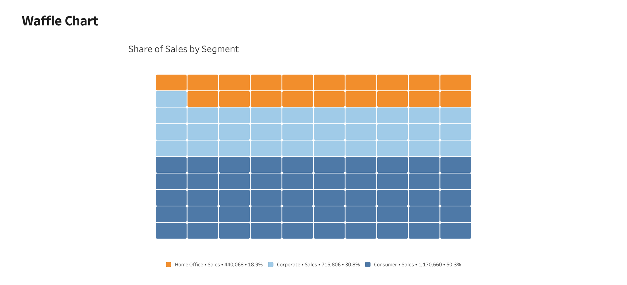
Read proportions precisely. The Waffle Chart displays categorical proportions as a grid of colored squares, making part-to-whole comparisons easy to read.
Overview
Native Tableau integration
Native to your dashboard Add it to a worksheet like any Tableau viz. It follows your filters, sorts, and dashboard actions, and refreshes live as the data changes. Nothing to export, connect, or configure.
Native Tableau integration
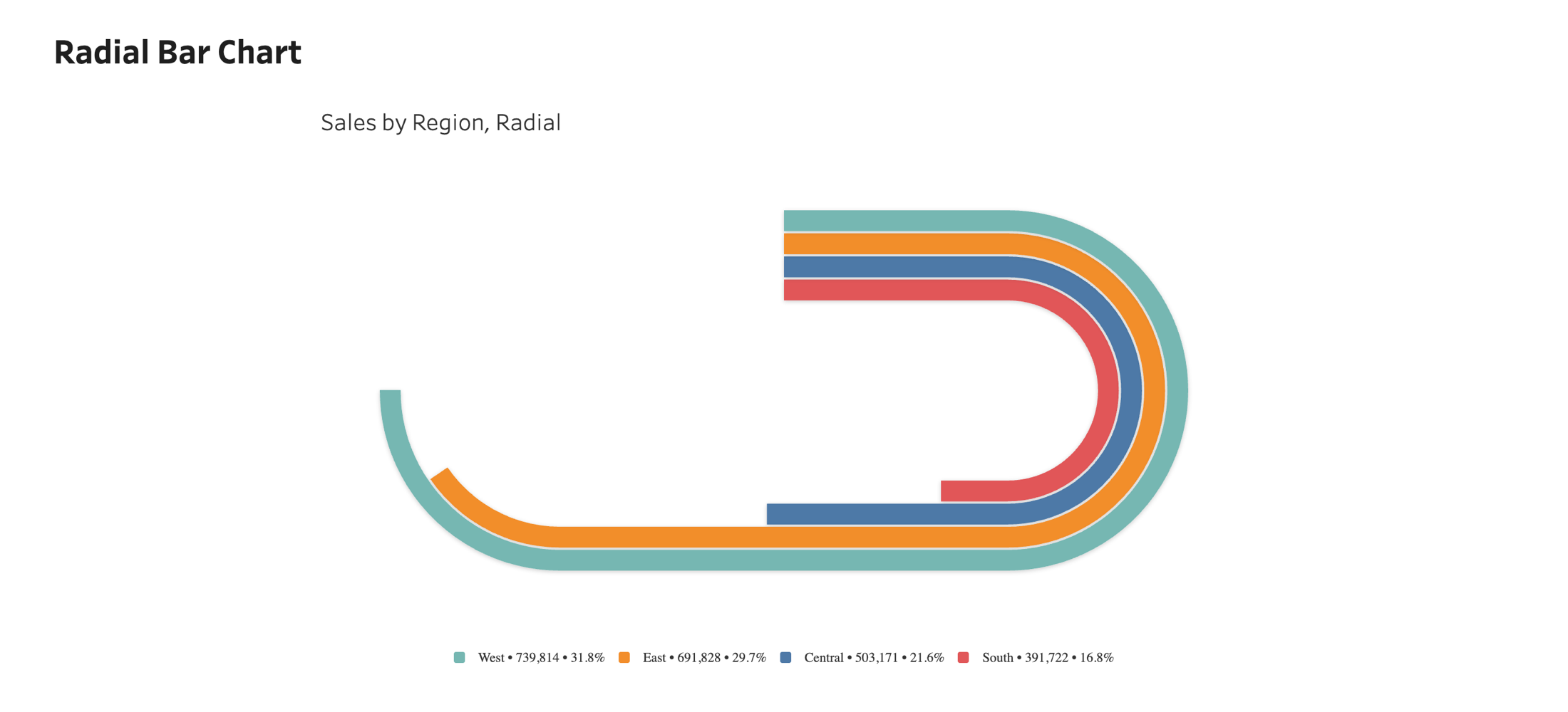
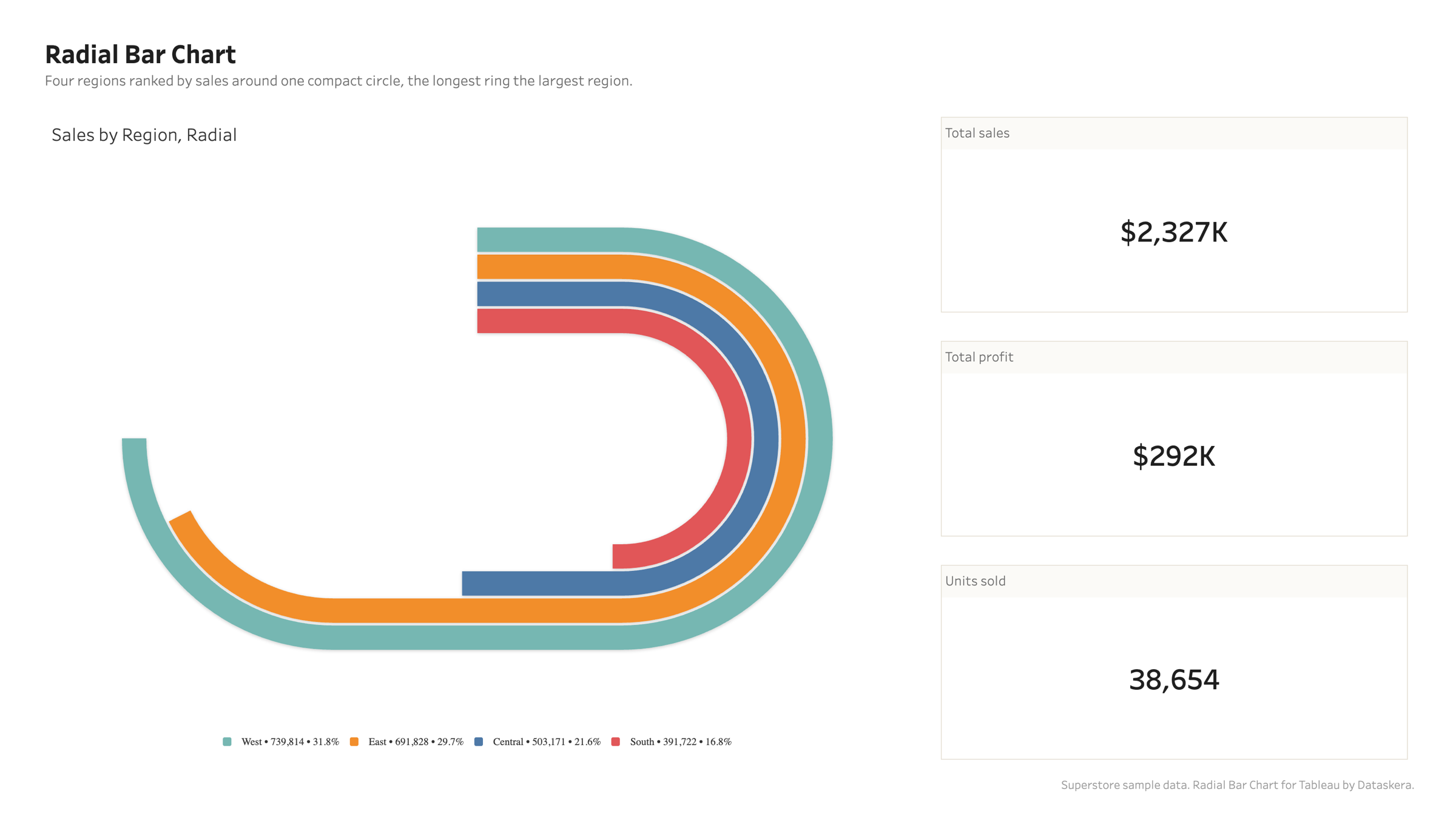
Radial Bar Chart
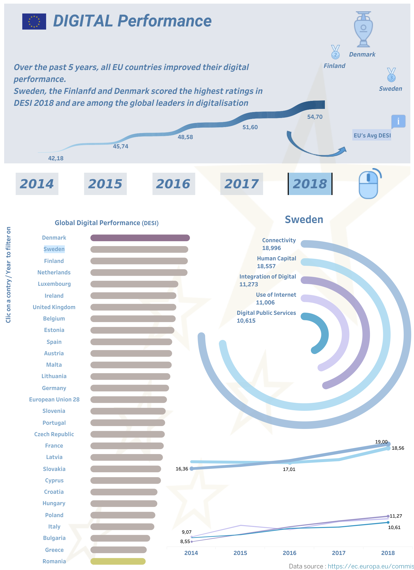
Turn a long bar chart into a compact circle. Compare many categories at a glance, ideal for rankings and part-to-whole views, without running off the edge of your dashboard.
Overview
Compact by design
Drag a dimension to Category and a measure to Value, and the rings render and scale on their own. Everything runs inside Tableau, on your machine: your data never leaves the browser. Free to use, on Desktop, Server, and Cloud.
Compact by design
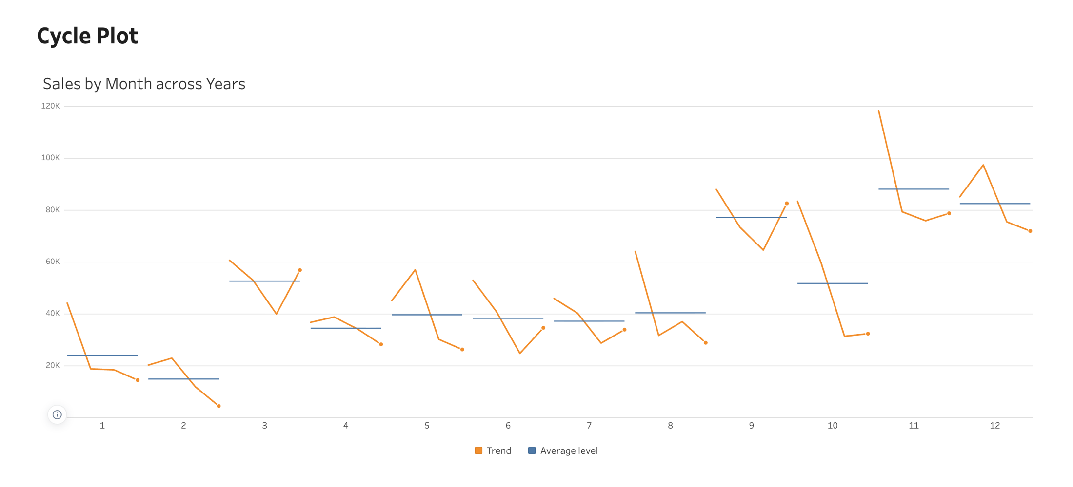
Cycle Plot
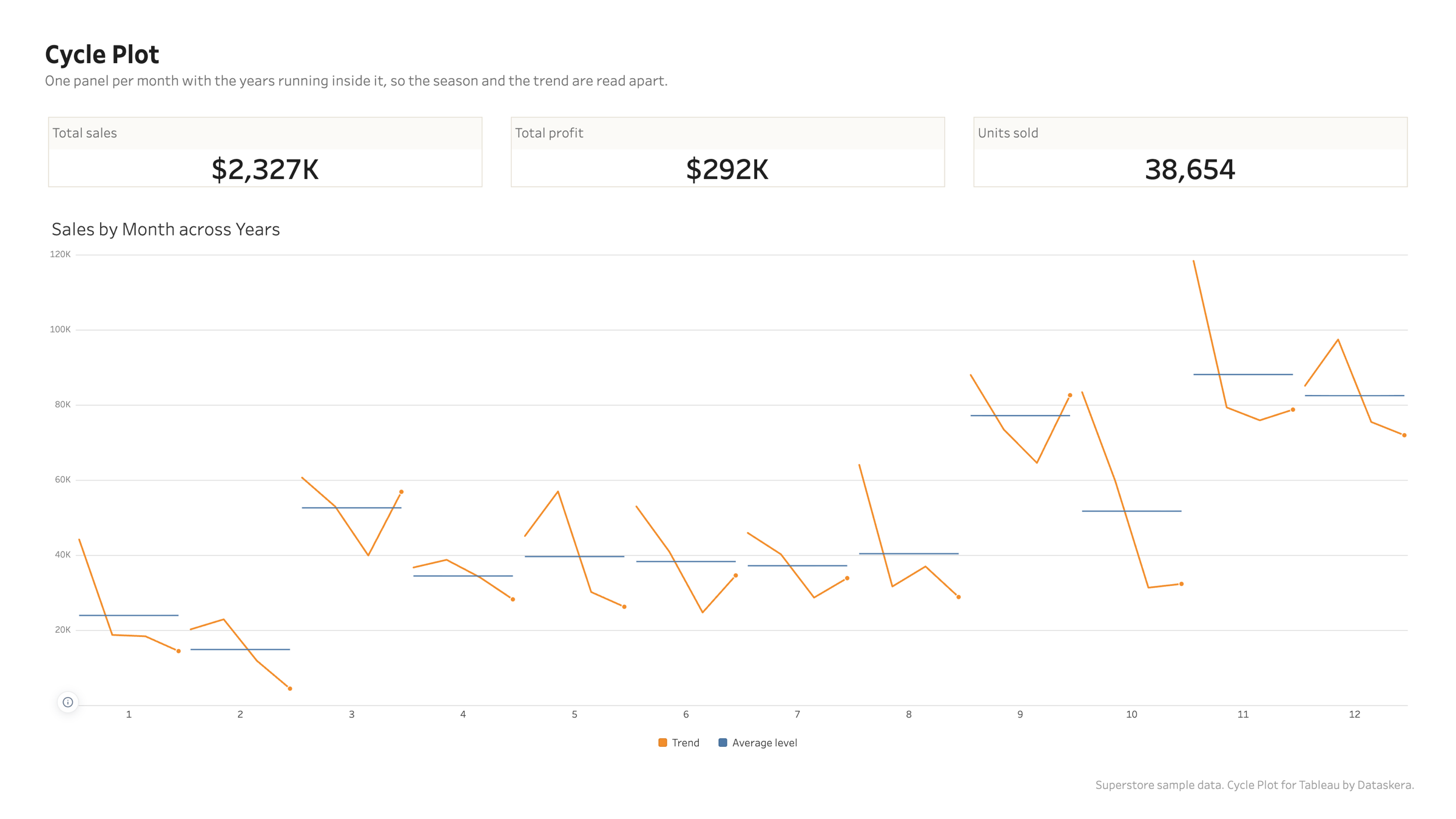
One panel per position in the cycle, the trend running inside each, and a level line showing where that position usually sits.
Overview
Two questions, read apart
Which month is the busy one, and is that month getting busier. A line by date answers neither. Here the level between panels answers the first and the trend inside each panel answers the second. On four years of Superstore, November averages 88,167 against February at 14,938, and every month is still visibly growing year on year underneath that.
Two questions, read apart
Correlation Matrix
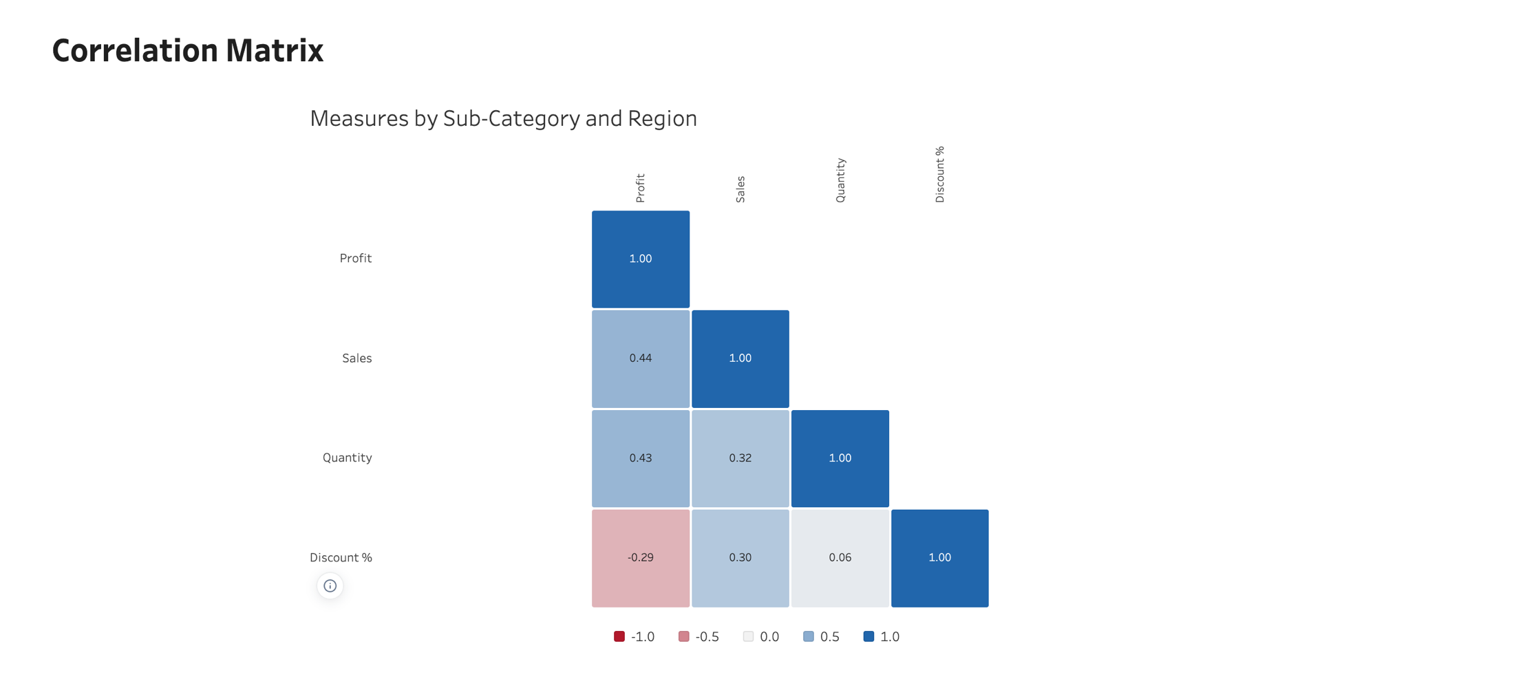
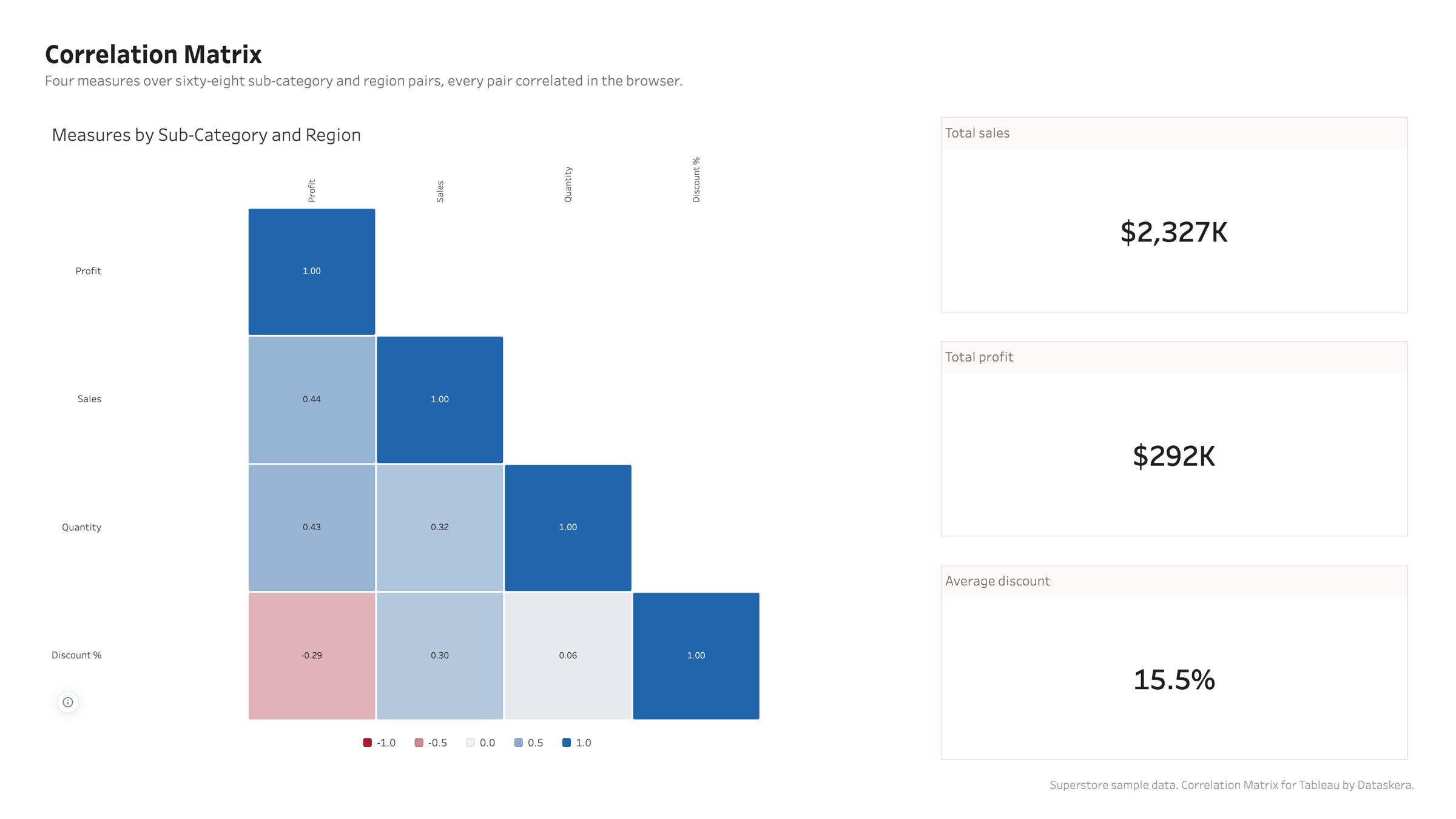
Which of these measures move together, computed in your browser from the rows on the sheet, with the method named and the sample size behind every cell.
Overview
Computed, not looked up
Drag two to ten measures onto one shelf and the dimension that defines an observation onto Level of Detail. On Superstore at sub-category and region, sixty-eight observations, discounting correlates plus 0.30 with sales and minus 0.29 with profit: it sells more and earns less, which is the sort of thing you find in ten seconds here and never find in a bar chart.
Computed, not looked up
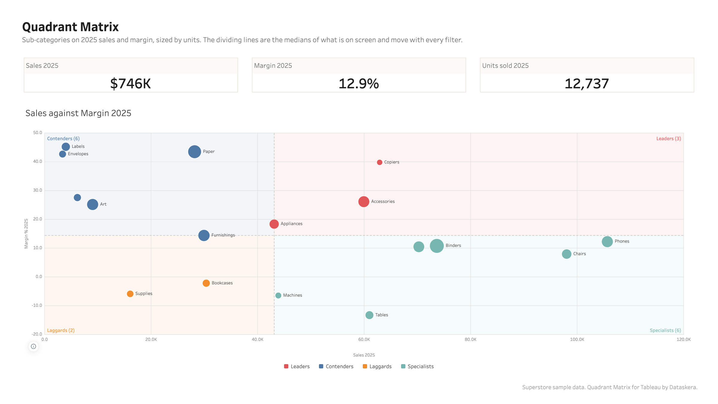
Quadrant Matrix
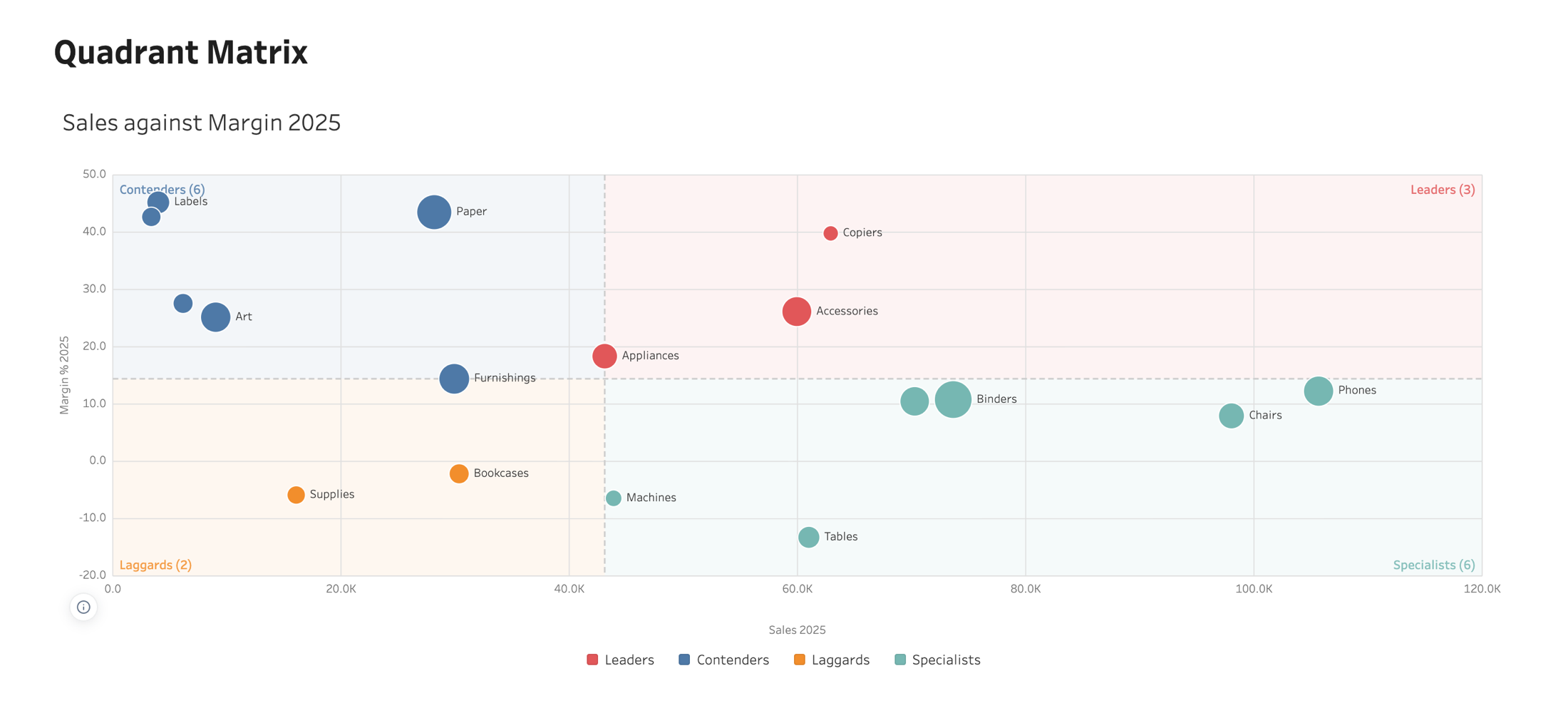
Two measures, a line through each and four named corners, with the dividing lines read from the data on screen instead of typed once and forgotten.
Overview
The lines follow the filters
A threshold typed once and left behind is how this chart goes wrong: the data moves and the line stays where it was one afternoon. The default is the median of what is on screen, recomputed every time, with the average, the mid-range, zero and fixed values as alternatives. Whichever rule drew them, the chart prints where its lines came from and whether they move.
The lines follow the filters
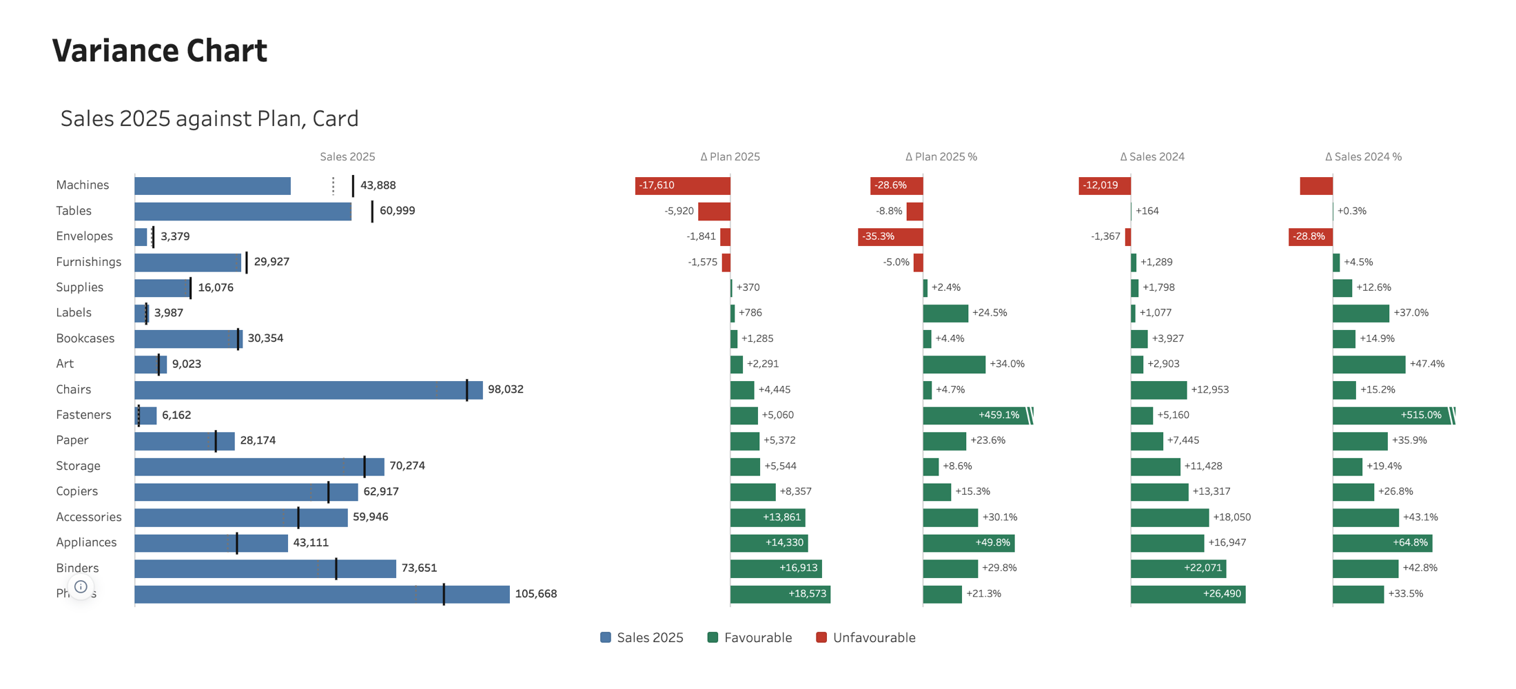
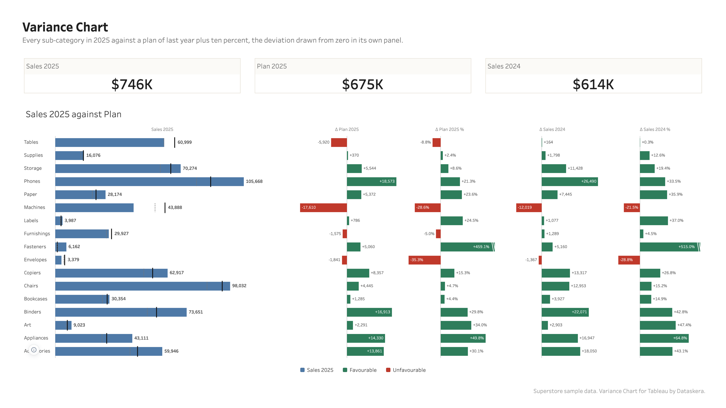
Variance Chart
Actual against plan on one line per account, with the deviation drawn from zero in its own panel, in the amount and in percent.
Overview
The bar is the amount, the plan crosses it
A second bar beside the first turns the comparison into a race for length and the value stops being readable. The plan is a needle across the actual bar instead, so how far the bar reaches still means the amount, and the gap gets a panel of its own measured from zero, because a gap is a quantity in its own right.
The bar is the amount, the plan crosses it
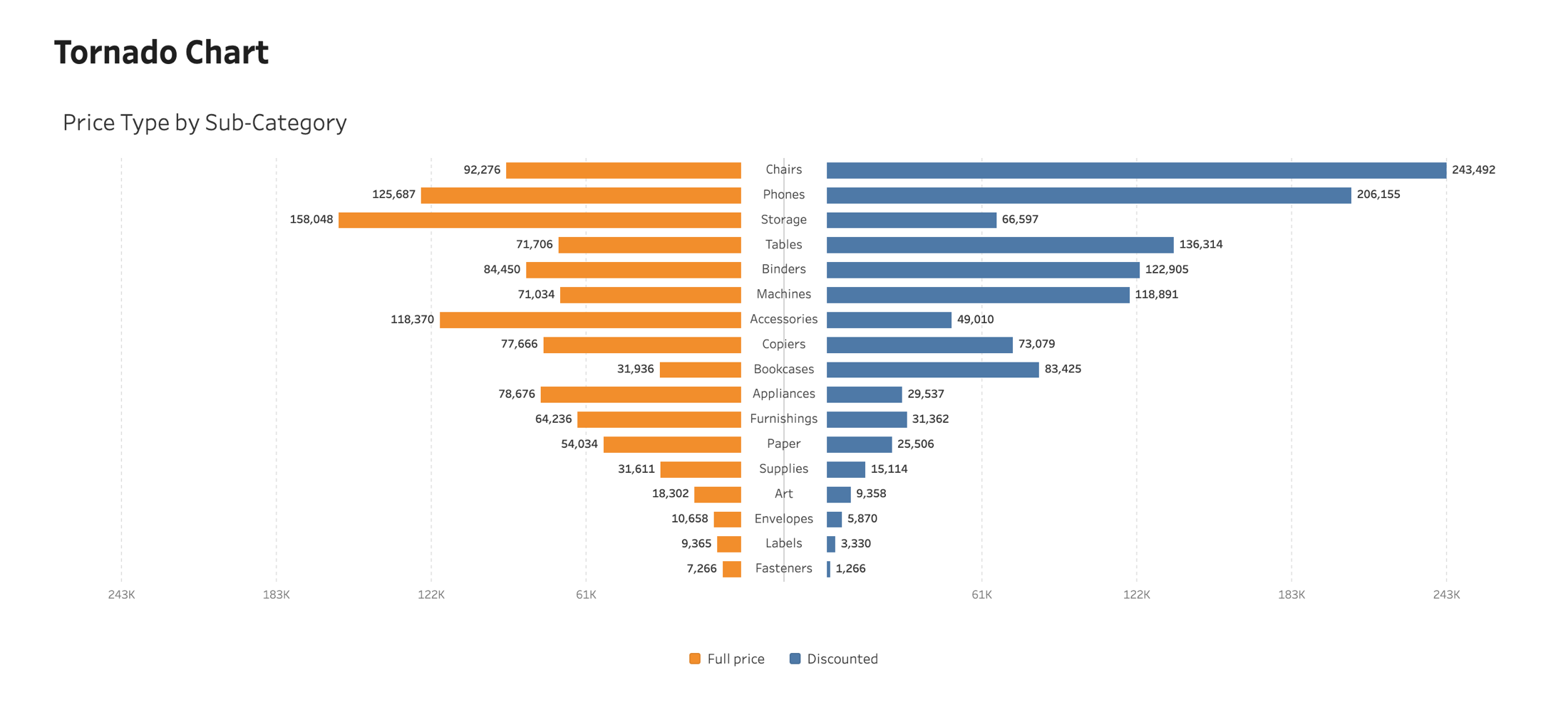
Tornado Chart
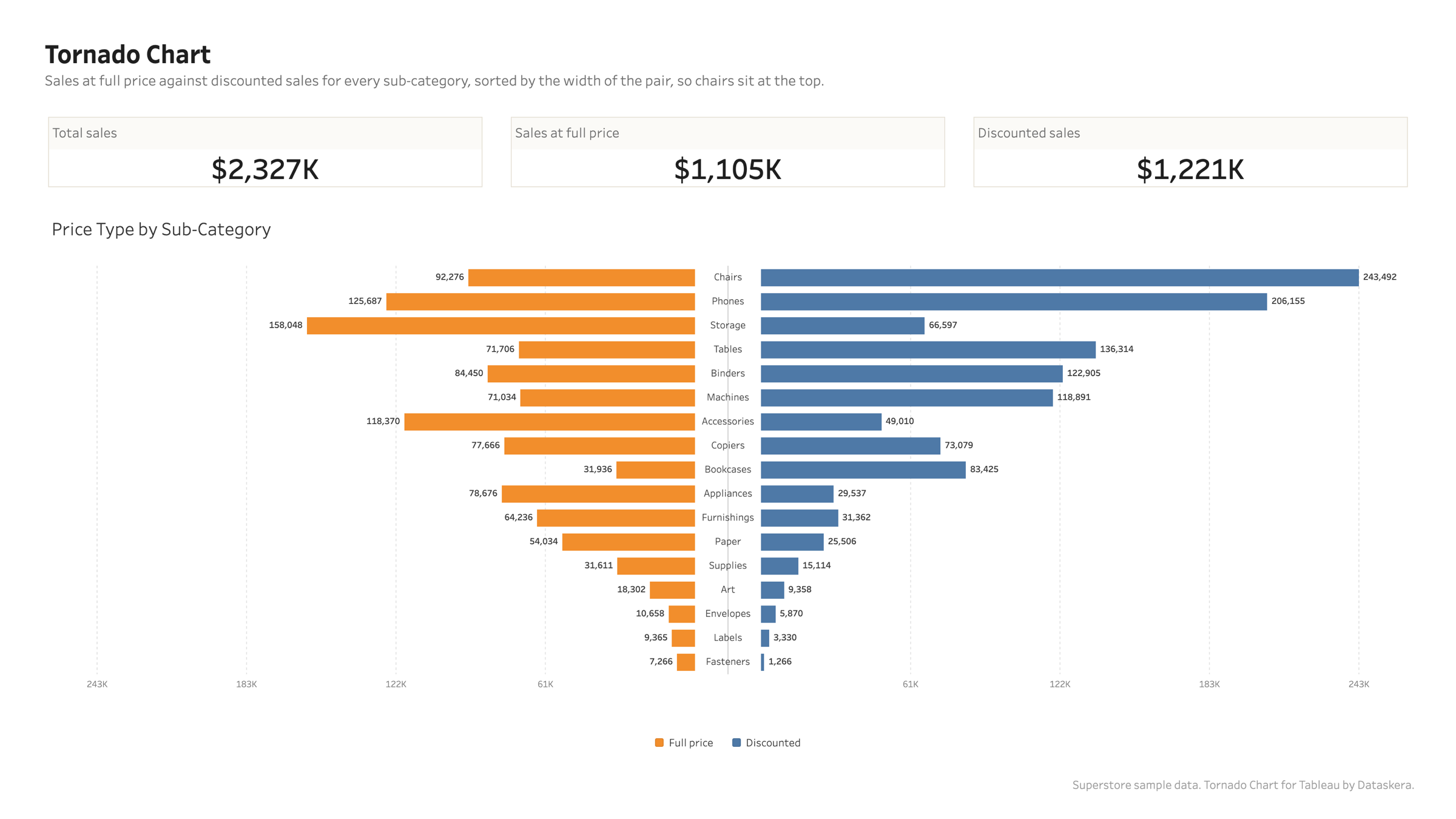
Two opposed bars per category around a shared centre. A sensitivity chart when it is sorted, a population pyramid when it is not.
Overview
The funnel that names the chart
Sorted by the width of the pair, the rows narrow from top to bottom and the drivers that move the number most sit where the eye lands first. On Superstore, chairs make the widest pair of full price against discounted sales.
The funnel that names the chart
Ridgeline Chart
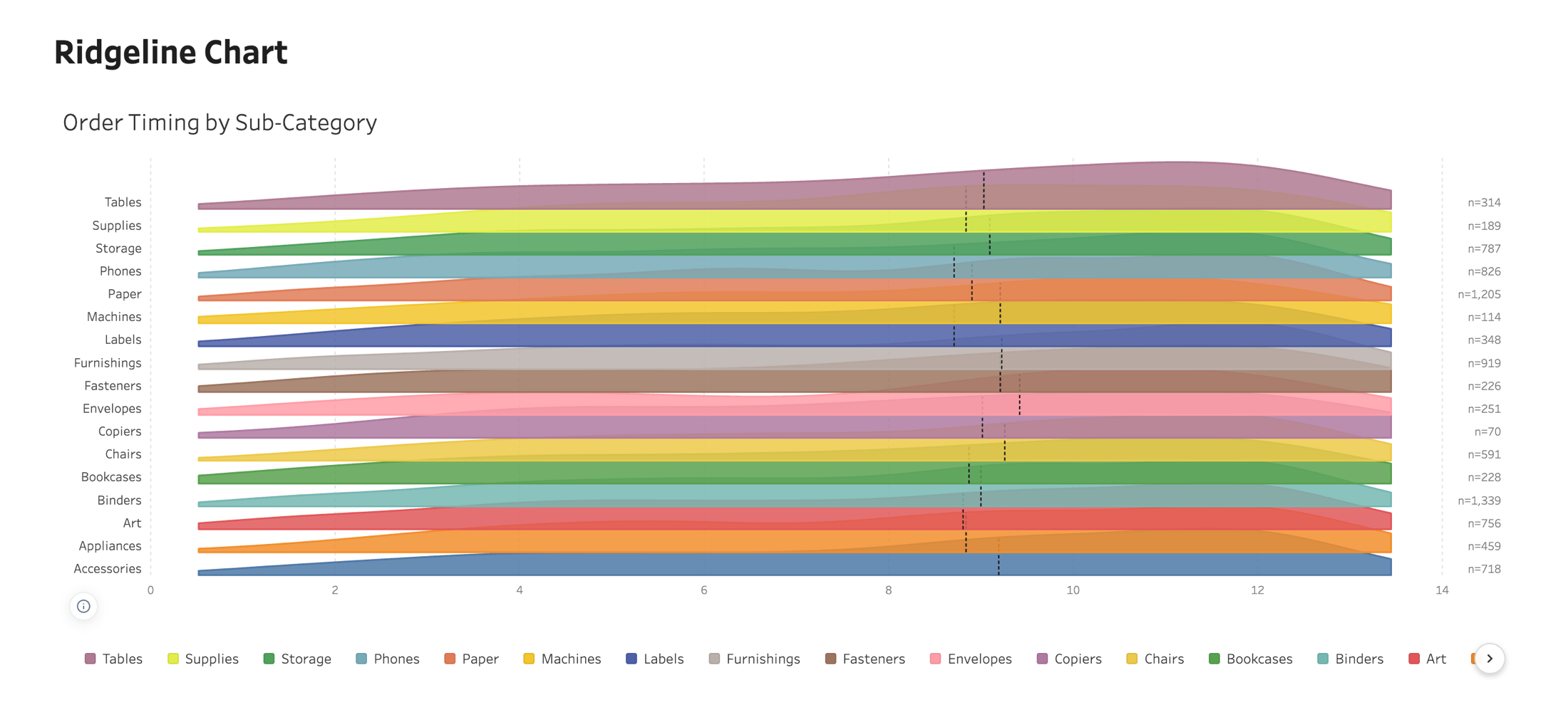
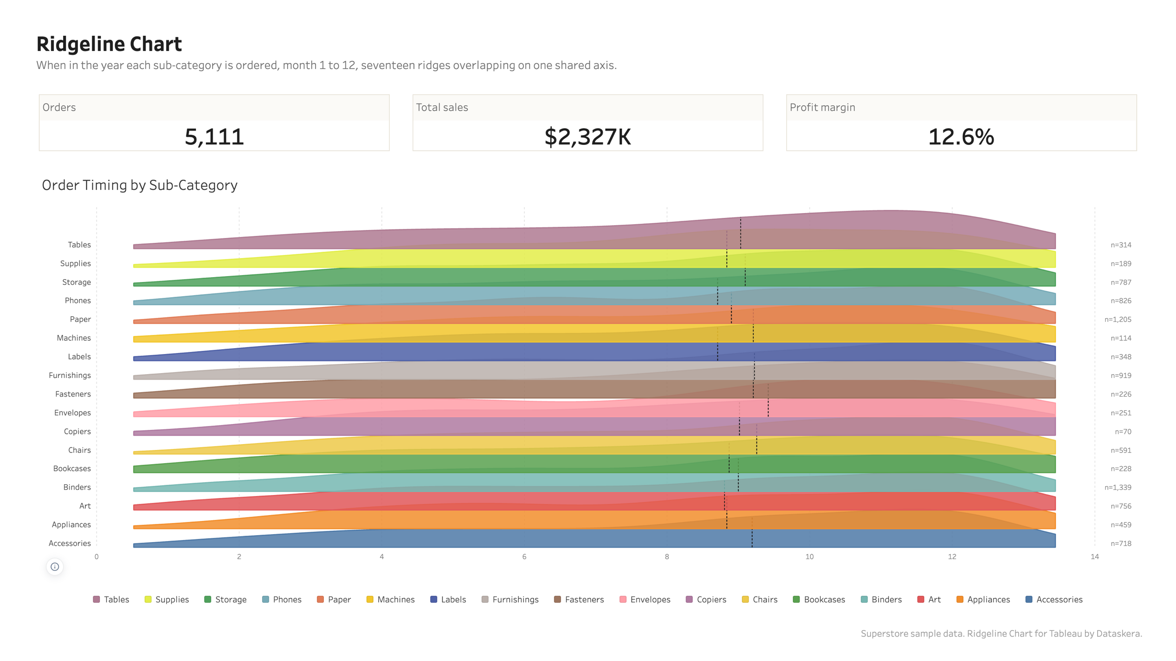
One density curve per group, overlapping down a shared axis, for comparing many distributions on a single page.
Overview
Overlap is the point, and it is yours
At nothing the ridges are small multiples; high up they sit almost on top of each other and a year fits in a pane. They are drawn back to front, so a ridge is always covered by the one below it and never the other way round.
Overlap is the point, and it is yours
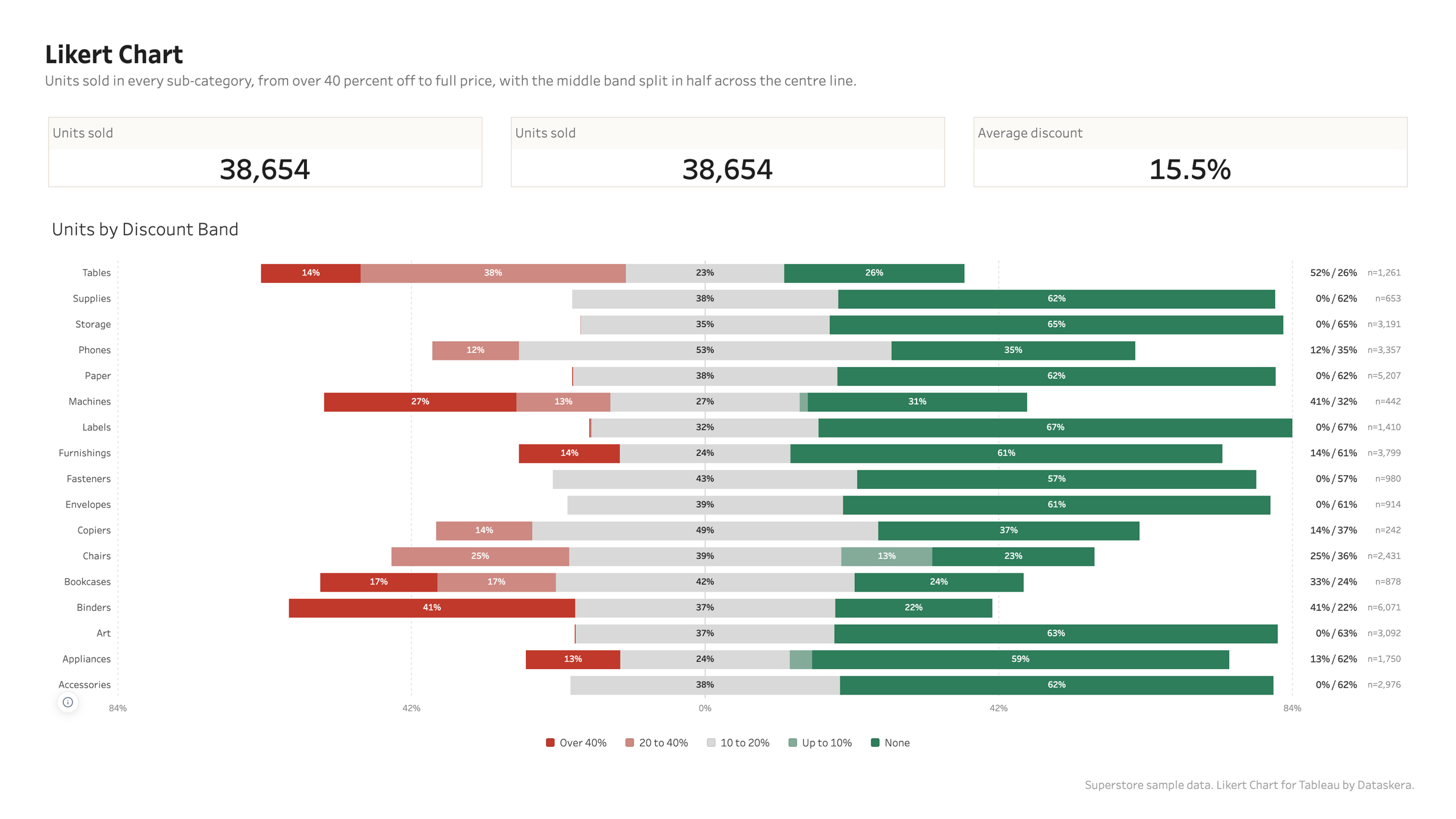
Likert Chart
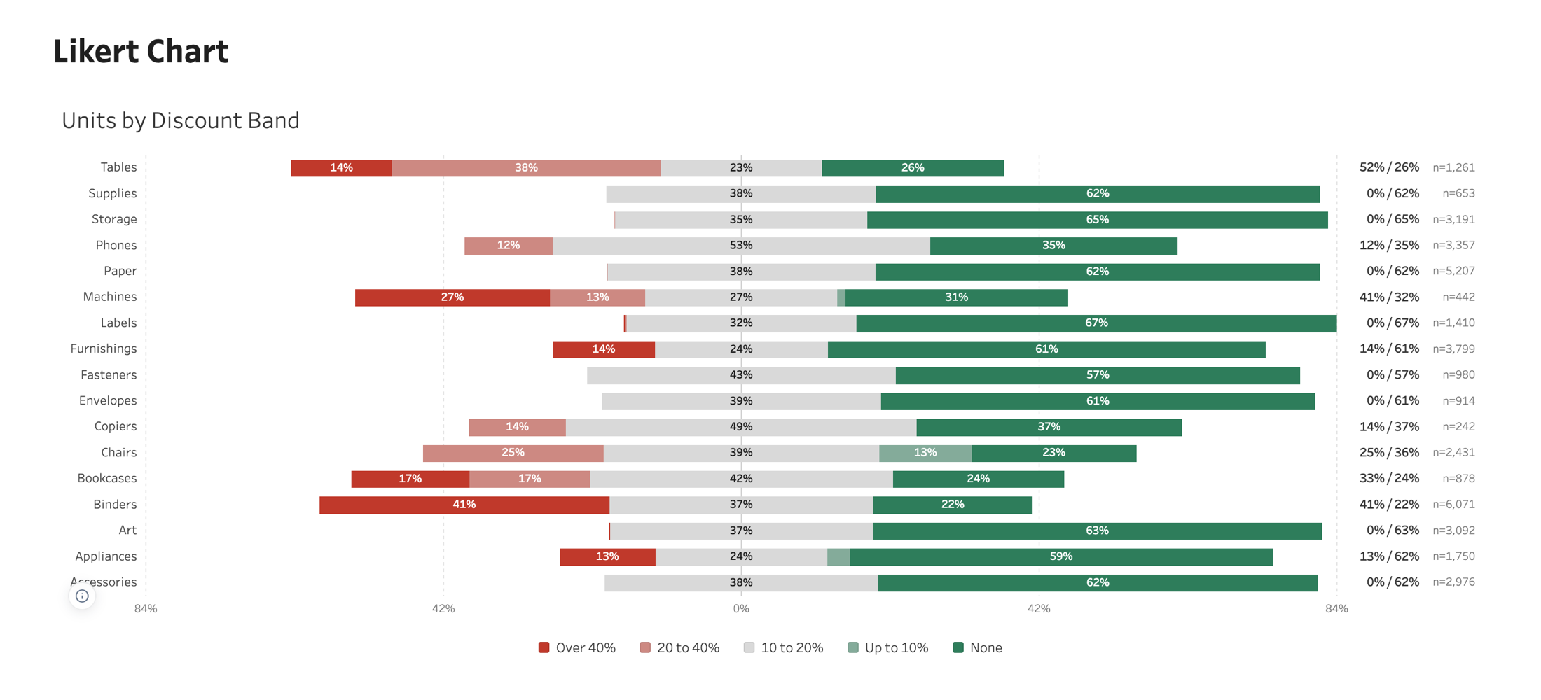
Survey answers on an ordered scale, one row per question, diverging around a centre, with the treatment of the middle answer stated rather than assumed.
Overview
The middle answer is your call
Split it at the centre and the centre line means half the answers lie to the left. Keep it on the right and the centre separates disagreement from everything else. Leave it out and the shares are rebased on the people who took a side. No reading is right for every survey, so the chart says which one it took.
The middle answer is your call
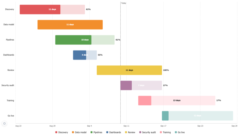
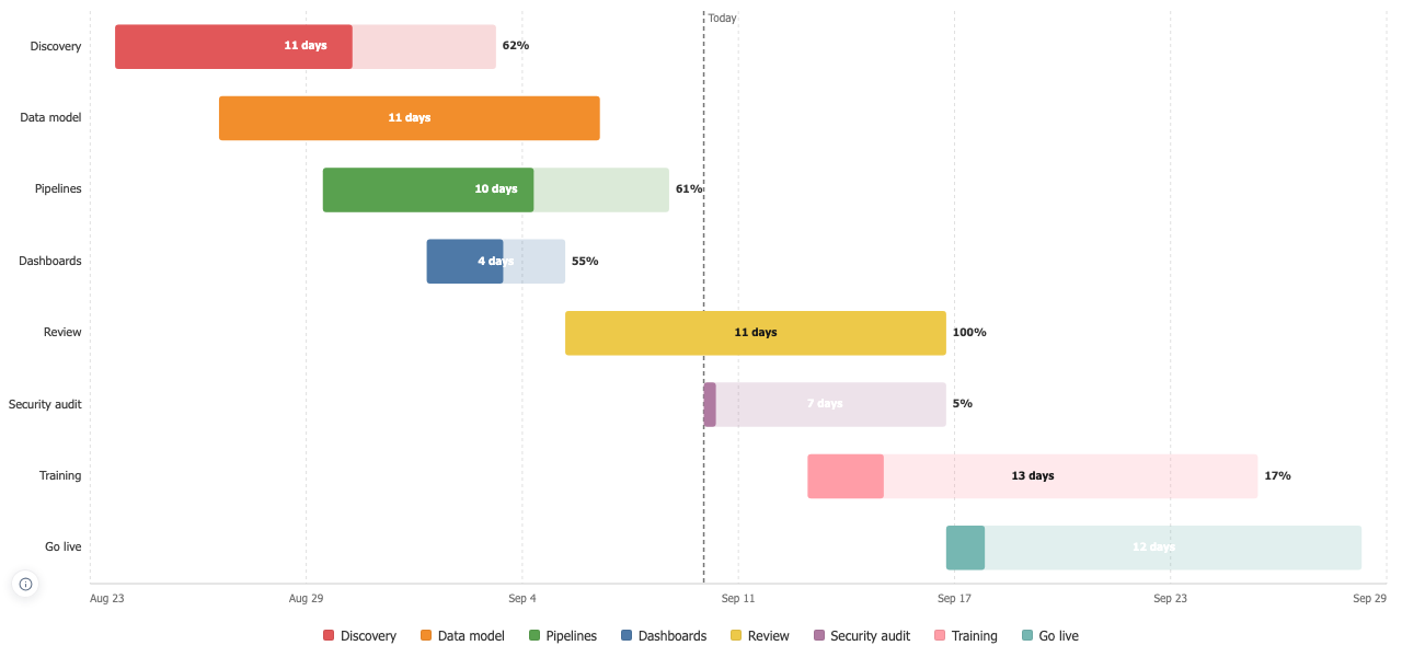
Gantt Chart
One bar per task from a start to an end, with completion drawn inside the bar and the work that should have been done by now shown as a shortfall.
Overview
Completion inside the bar
A task with a completion value turns its bar into a track and fills it, so the progress reads at any opacity. The value is taken as nought to one or as nought to a hundred, decided once for the whole column and stated, because deciding row by row would read a single overshoot as a fraction of a percent.
Completion inside the bar
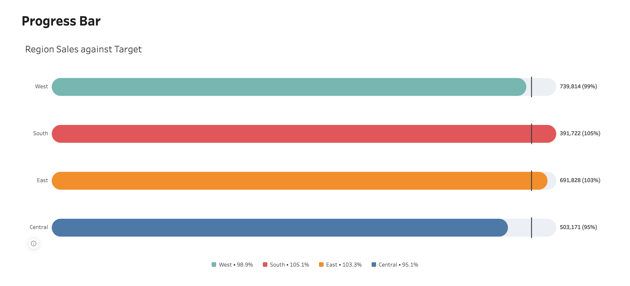
Progress Bar
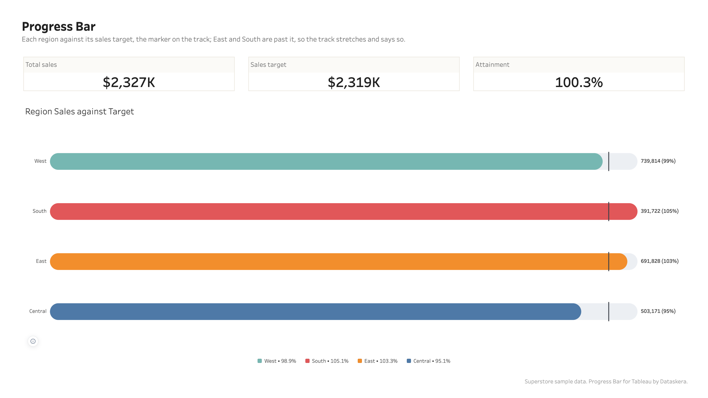
Progress towards a target, one bar per category, with the target marked and an overall row computed from the totals.
Overview
The target is on the track
A marker where the goal sits, the bar filling towards it, and the value, the percentage or both at the end. Past target the track stretches so every bar stays on one scale, and the chart says it did.
The target is on the track
Lollipop Chart
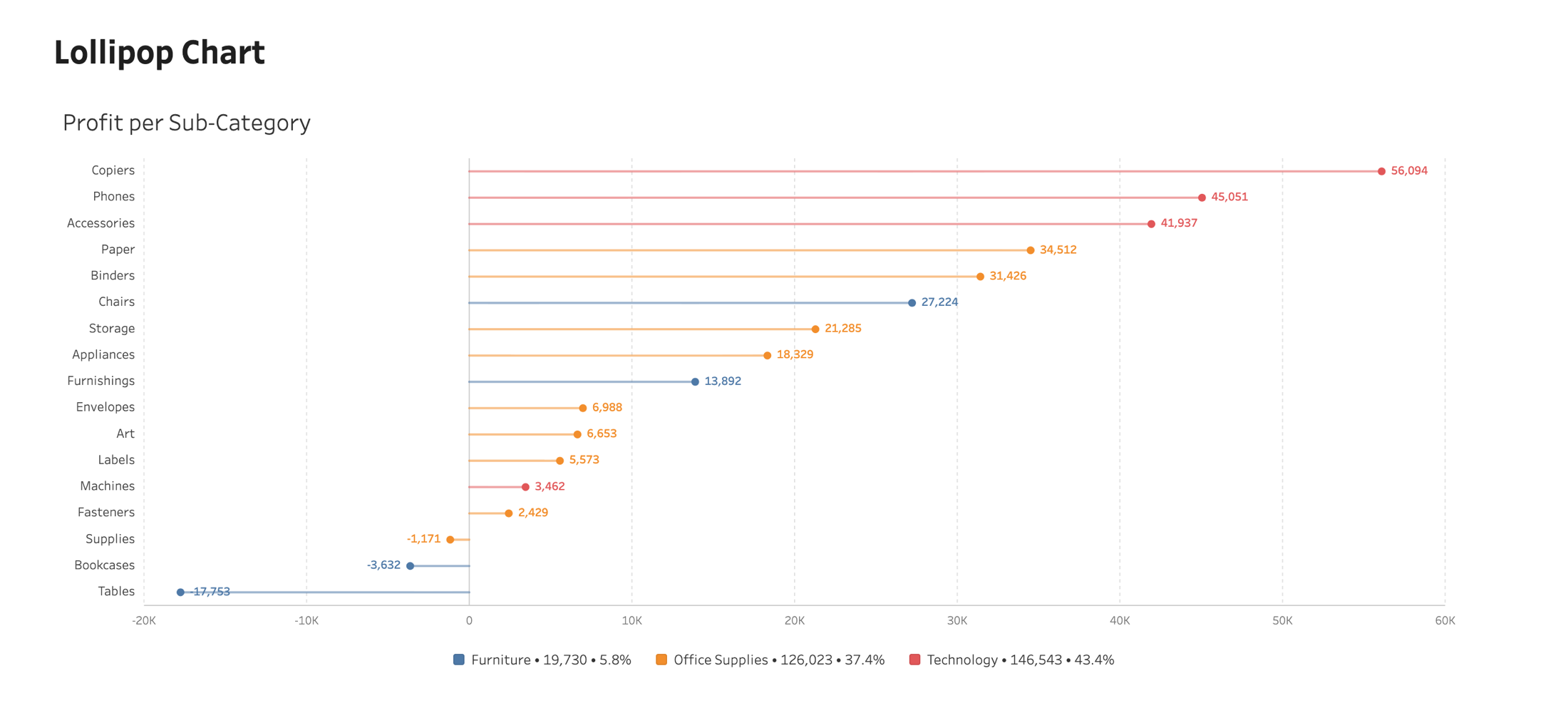
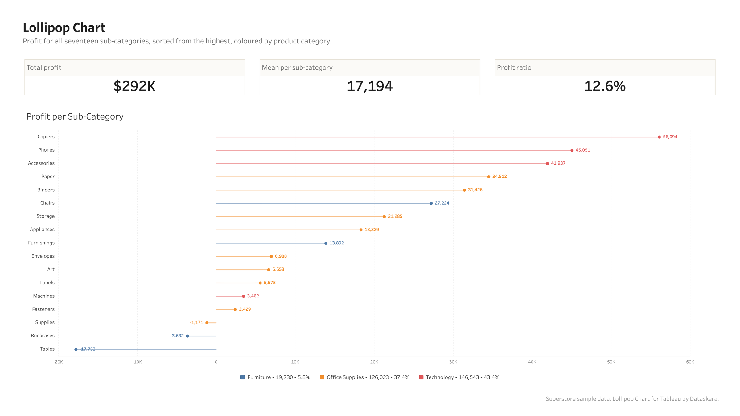
A bar chart that keeps its nerve when there are many categories, and the one shape that can honestly be measured from something other than zero.
Overview
Many categories, no wall of ink
Thin stems and small heads stay readable where bars turn into a solid block. Sort them, colour them by a dimension, put them across or down the page.
Many categories, no wall of ink
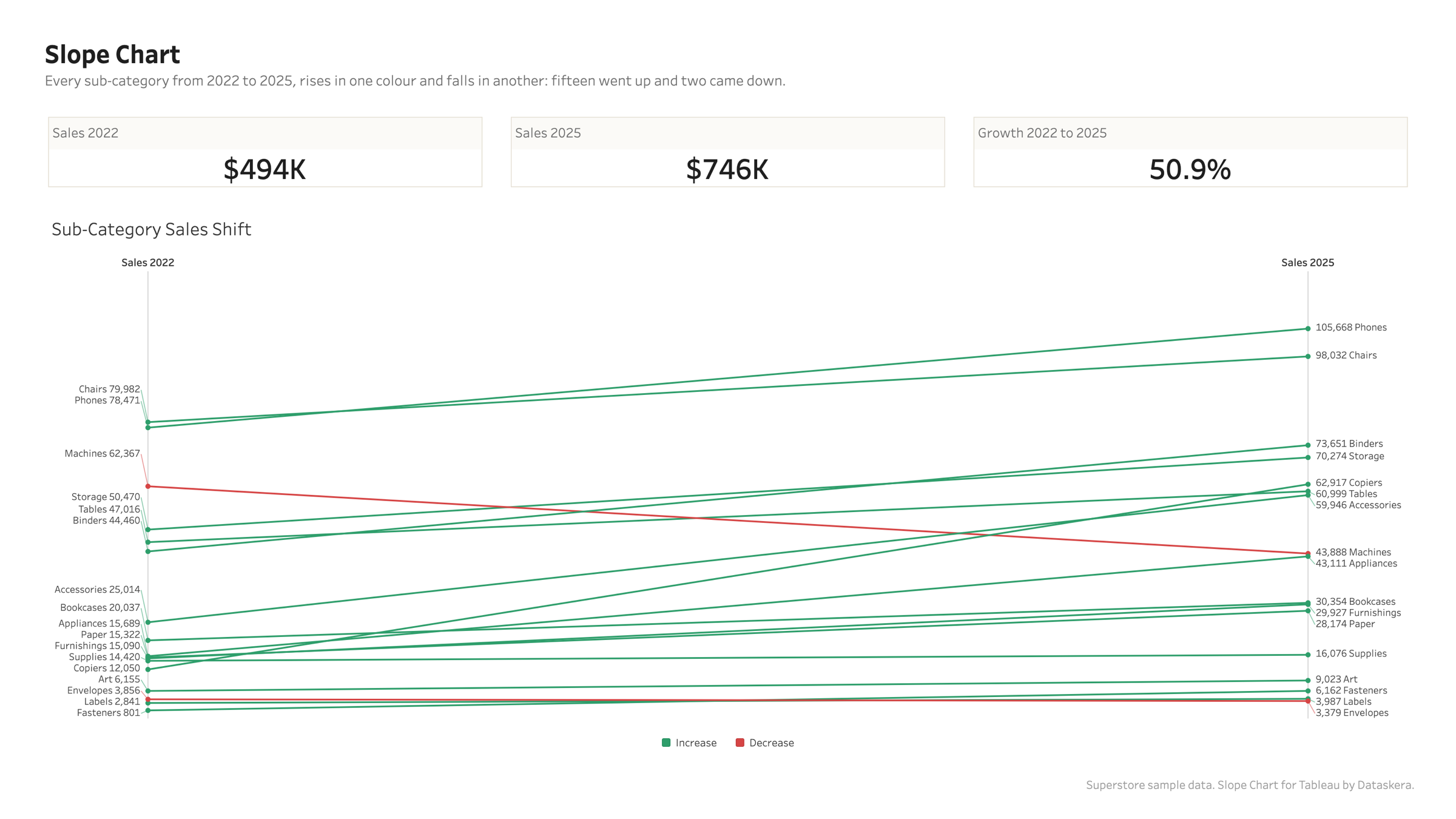
Slope Chart
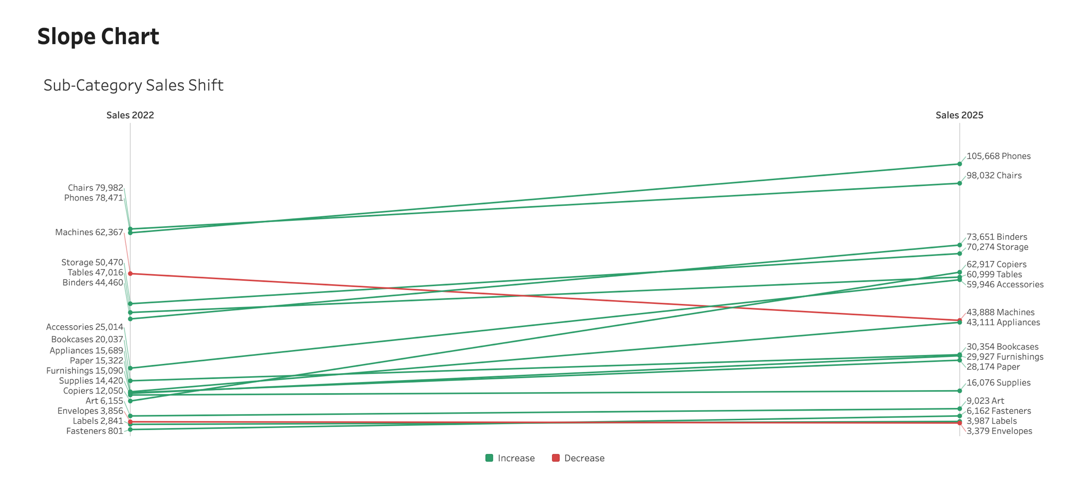
Two columns, one line per category between them. Rank changes and crossings read at a glance.
Overview
Direction in colour
Every rise in one colour, every fall in another, and the legend counts them. On Superstore between 2022 and 2025, fifteen sub-categories rose and exactly two fell, and the two red lines are the whole story.
Direction in colour
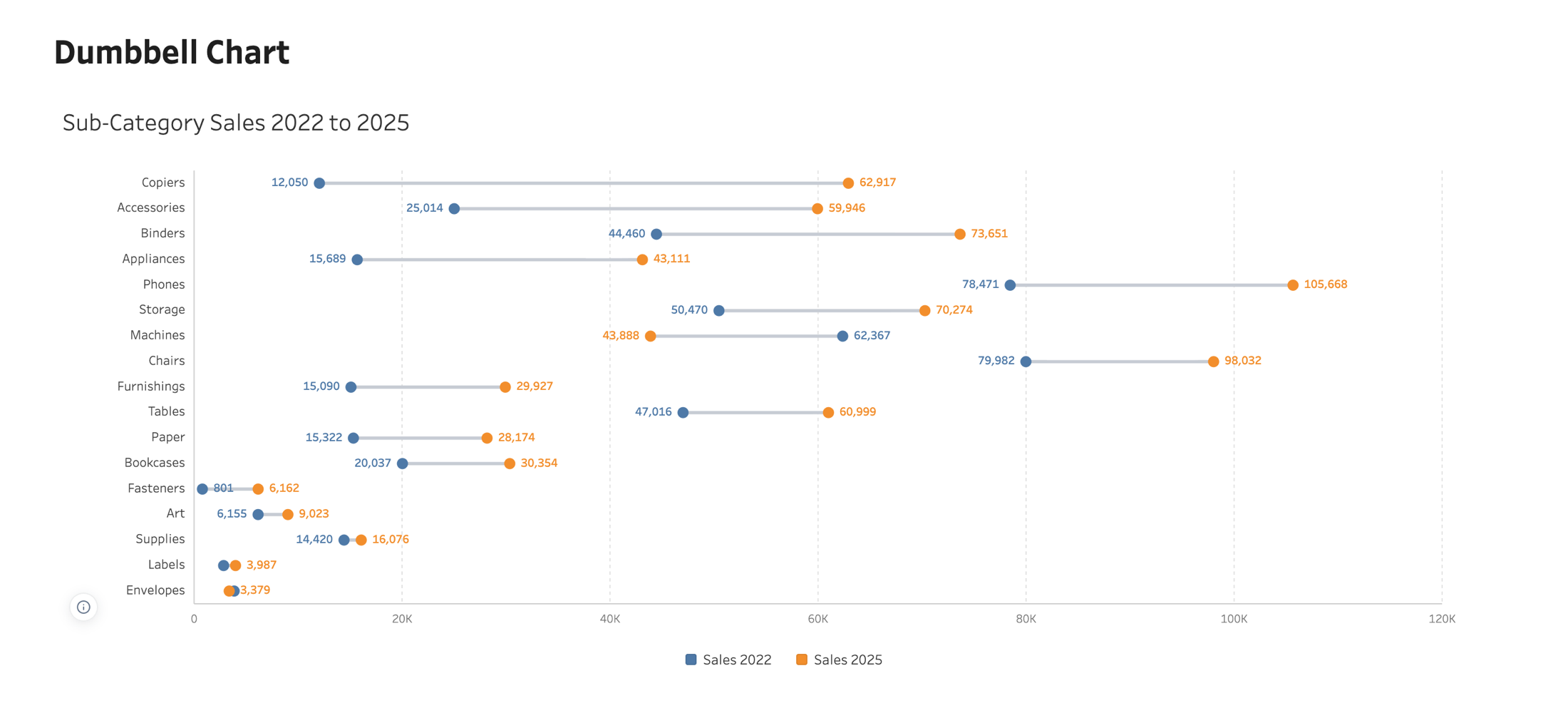
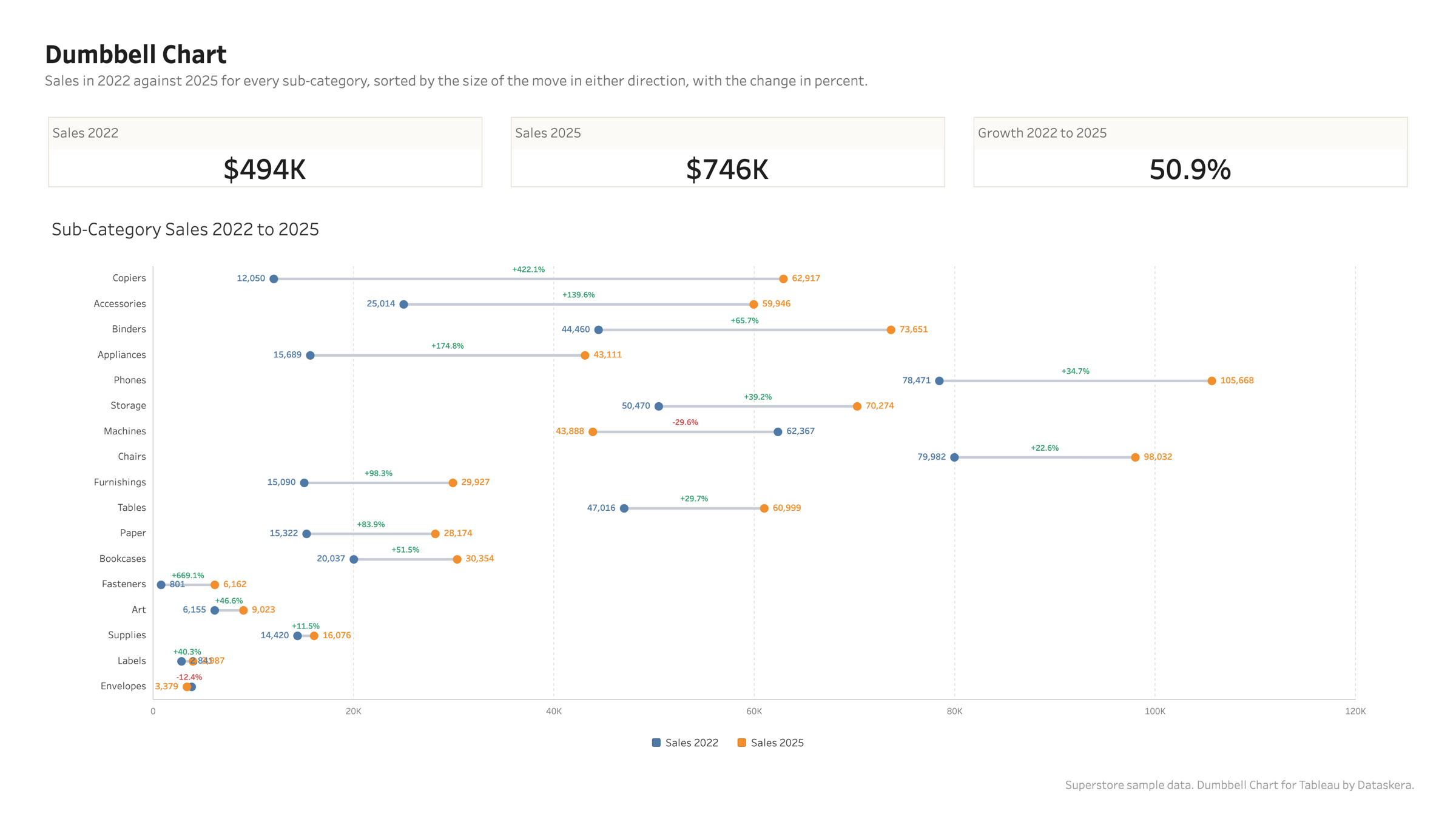
Dumbbell Chart
Two values per category, a dot each and a connector between them. The length of the connector is the change.
Overview
Sorted by how far, not which way
Sorting by change buries the biggest collapse at the bottom of the chart. Sorting by the size of the move, in either direction, brings the real movers to the top. On Superstore that puts Copiers first at plus 422 percent and Machines high up at minus 30.
Sorted by how far, not which way
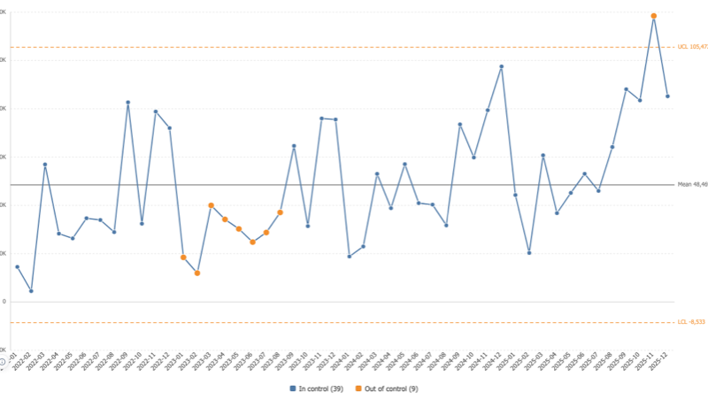
Control Chart
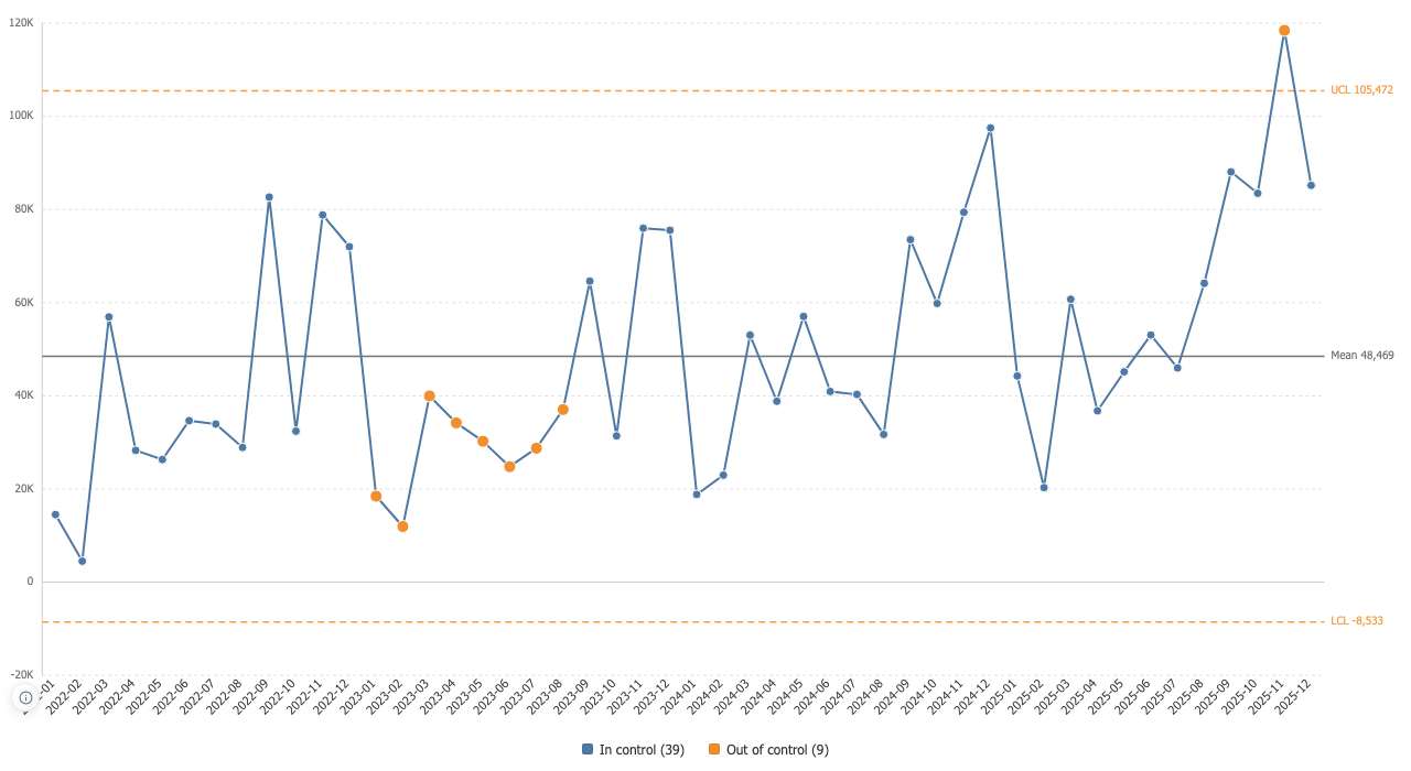
Statistical process control inside Tableau: control limits from the moving range, the Nelson rules, and every flagged point naming the rule that flagged it.
Overview
Limits that do not hide the drift
Sigma is estimated from the moving range of consecutive points, so a shift in the process cannot widen the limits meant to catch it. The standard deviation is there when you want it, and the limits carry their numbers.
Limits that do not hide the drift
Cohort Grid
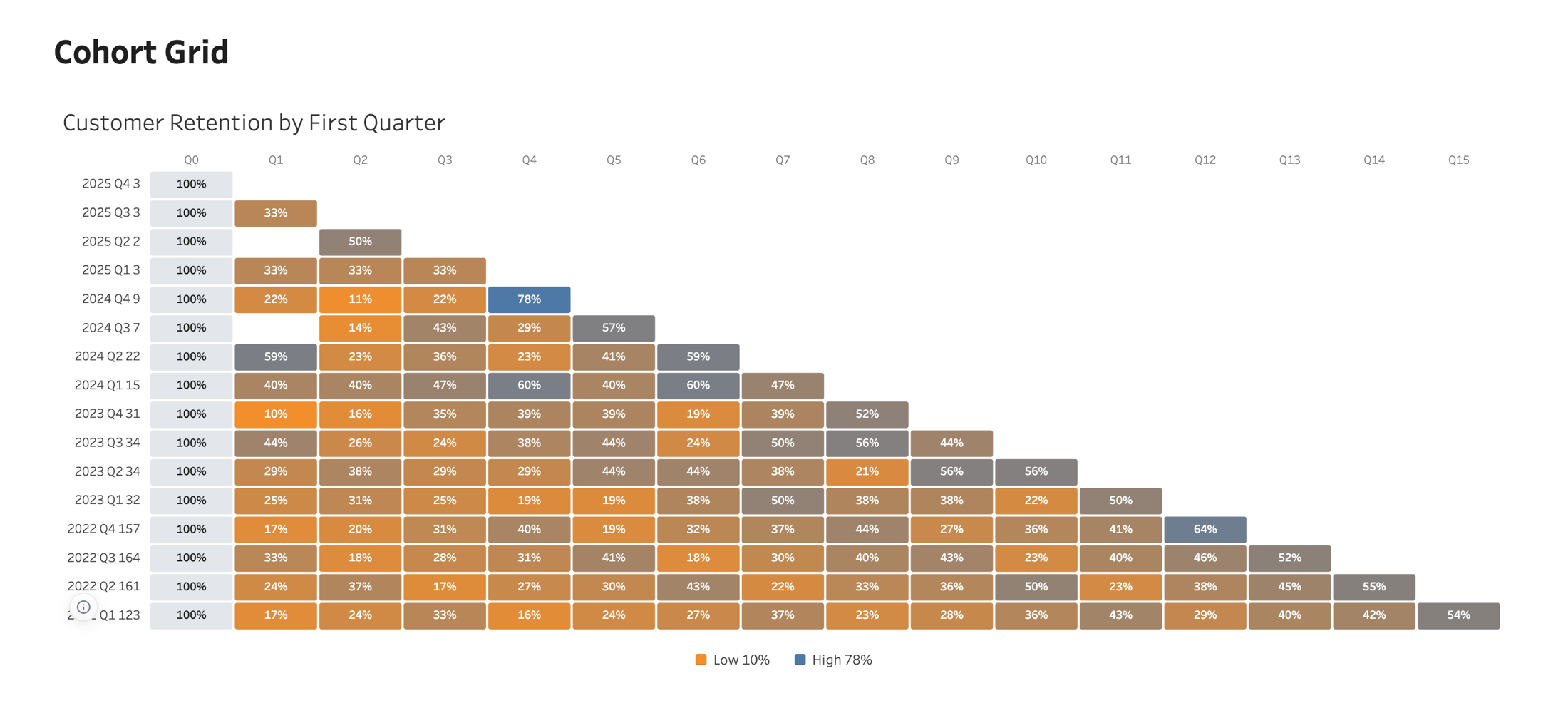
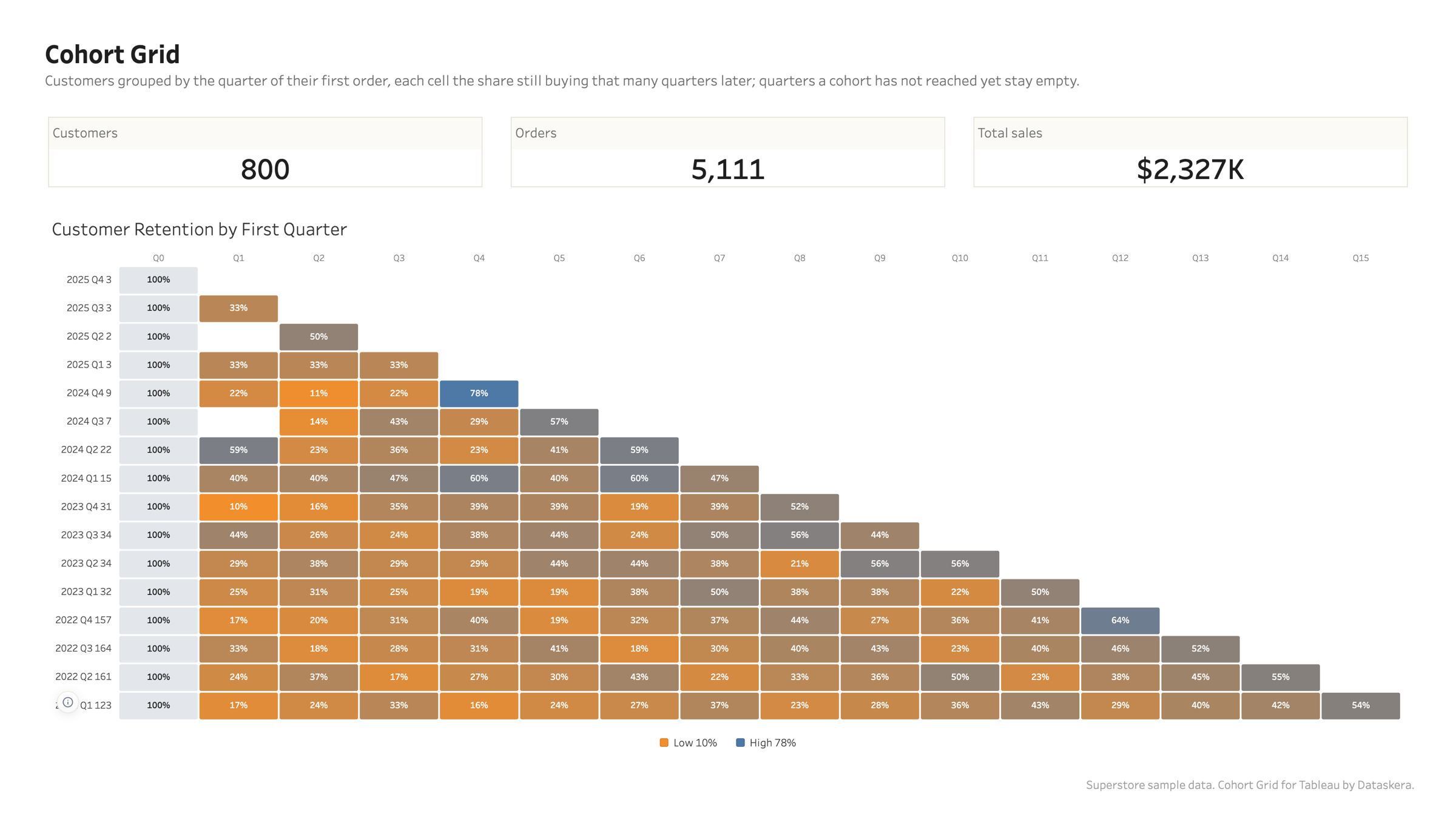
One row per cohort, one column per period since it started, colour carrying the value, and an average row underneath to compare against.
Overview
Aligned by age, not by calendar
Cohorts start together on the left whatever month they began in. Periods a cohort has not lived through yet stay empty rather than being filled with a zero, so the triangle is the truth about your data.
Aligned by age, not by calendar
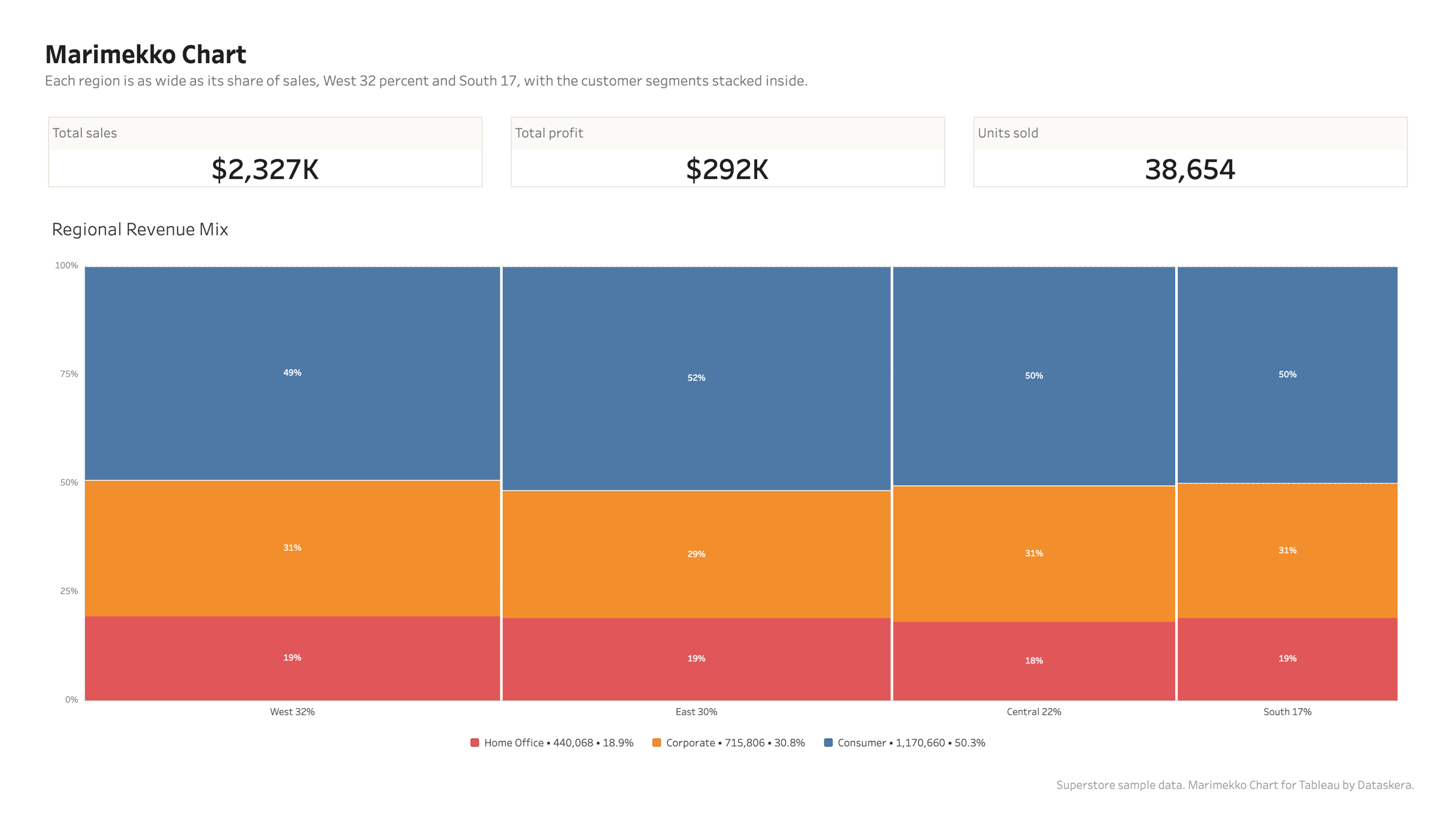
Marimekko Chart
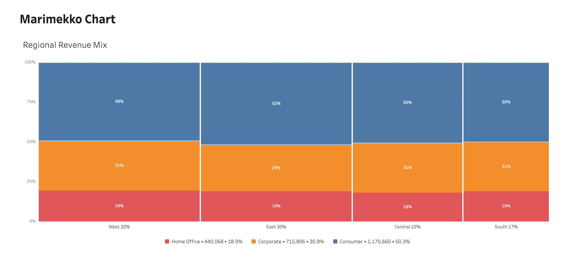
Column width is each category share of the total, segment height is each part share of its column. Two proportions in one picture.
Overview
Width carries the share
Every column is as wide as its share of the grand total. On Superstore, West is 32 percent of sales and South is 17, and the columns are exactly that wide before a single label is read.
Width carries the share
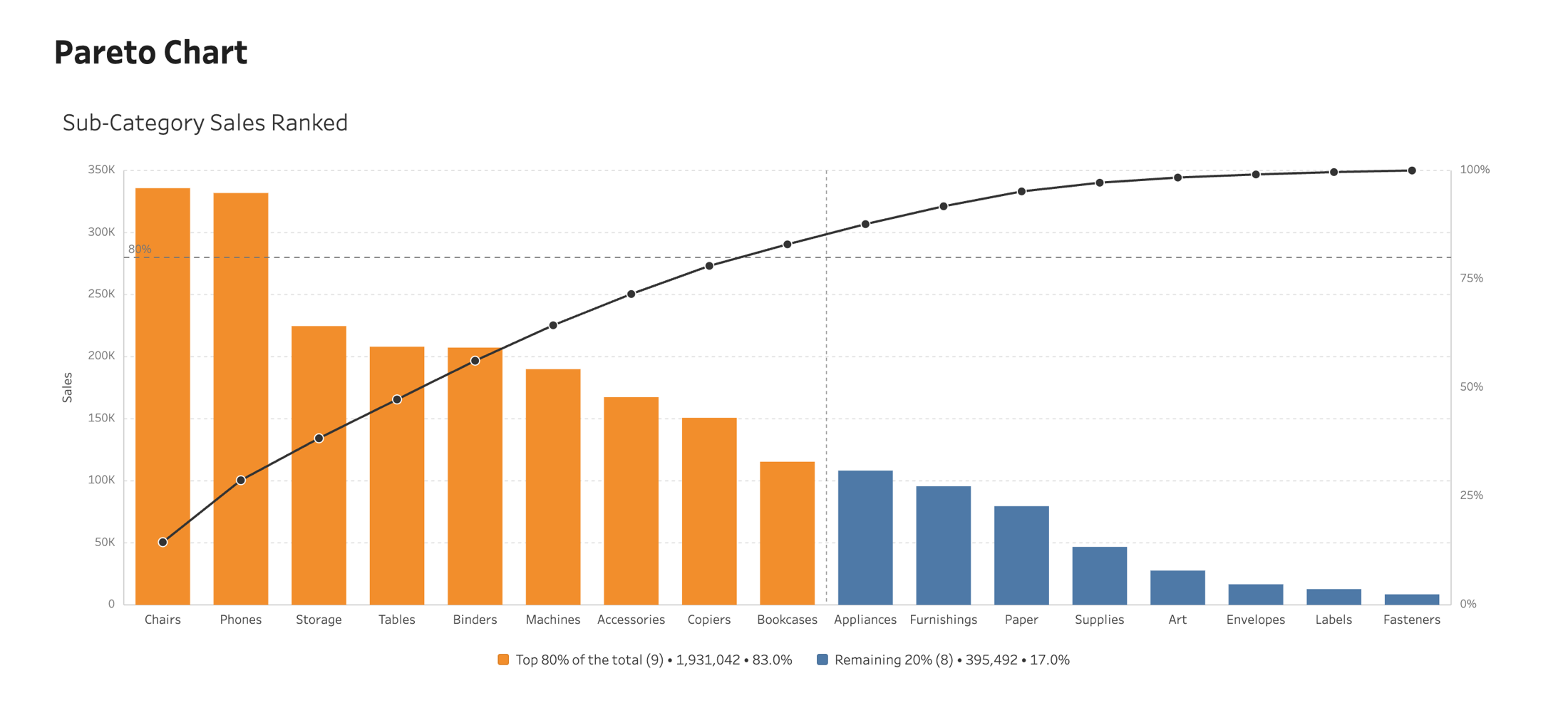
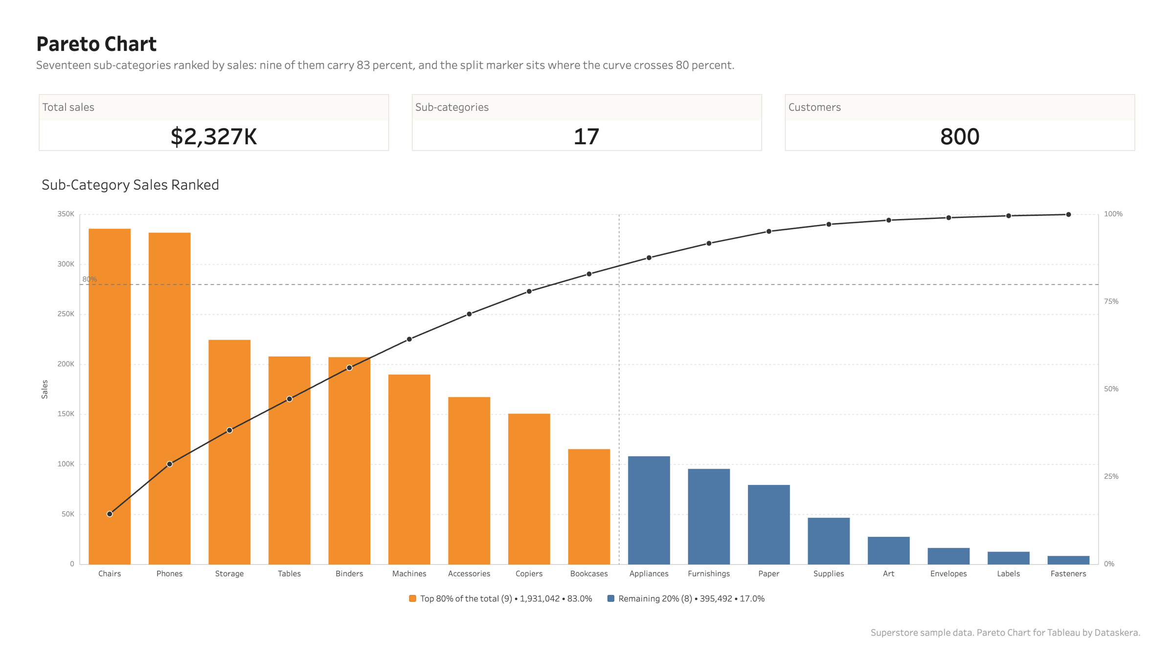
Pareto Chart
Bars falling from largest to smallest with a cumulative curve climbing to a hundred percent, and a threshold line where the vital few end.
Overview
The split is drawn, not implied
A vertical marker sits exactly where the cumulative curve crosses your threshold, and the two colours change at the same bar. On Superstore, nine of seventeen sub-categories carry 83 percent of sales, and the legend says so in real numbers.
The split is drawn, not implied
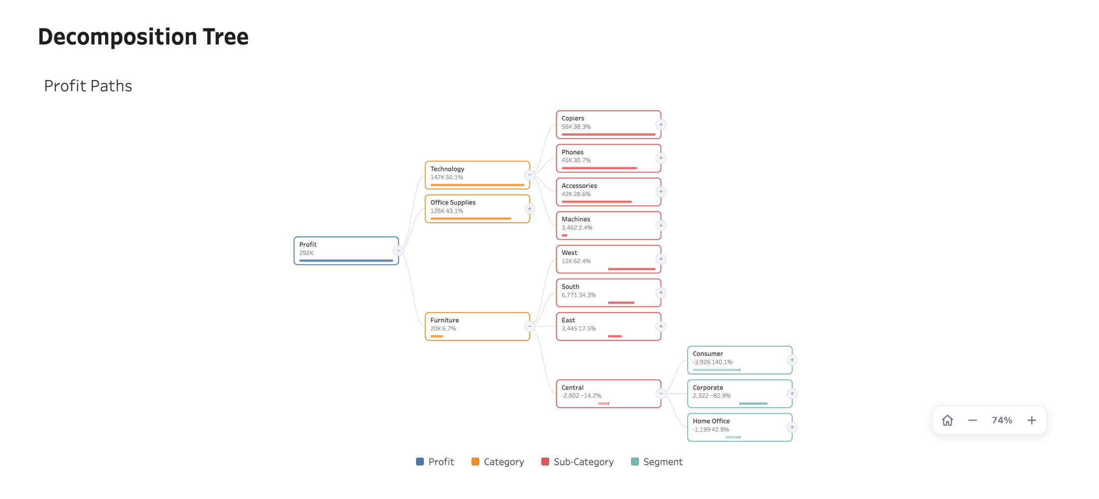
Decomposition Tree
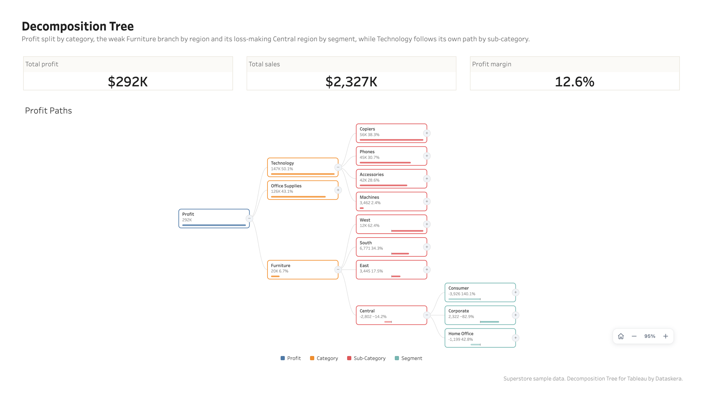
Break a measure down dimension by dimension, choosing the path as you go. The author saves a starting layout; every reader explores their own.
Overview
One measure, any path
Every node splits by the dimension you choose at that node, so two branches of the same tree can follow different paths. Bars and shares keep every level comparable.
One measure, any path
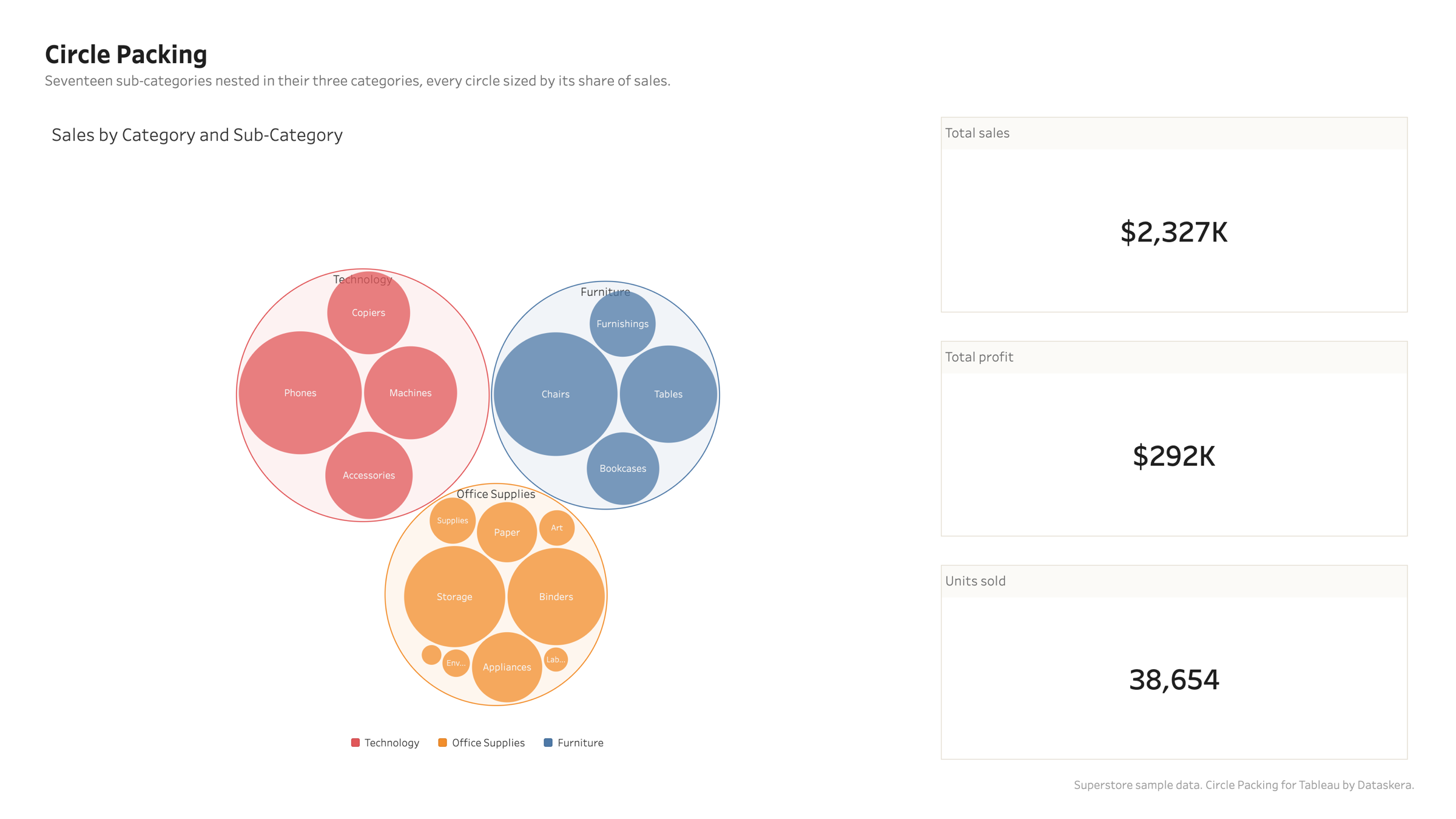
Circle Packing
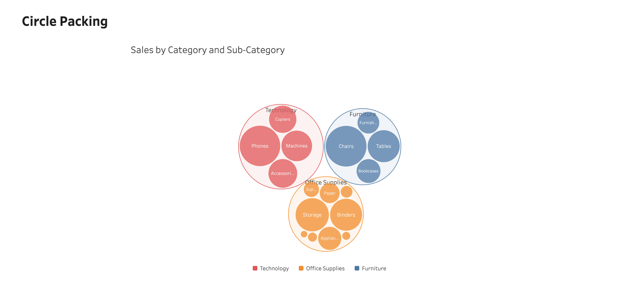
A zoomable, nested view of a portfolio: levels of dimensions define the nesting, a measure defines the area, a click dives in.
Overview
The whole portfolio in one view
Up to four levels of dimensions nest inside each other, every circle sized by its share. The big players are visibly big, and the long tail is visibly a tail.
The whole portfolio in one view
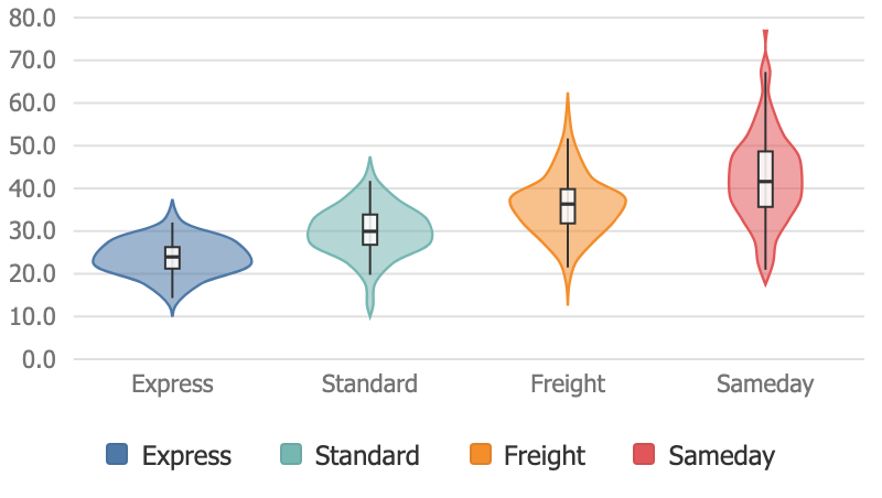
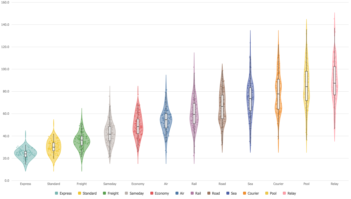
Violin Plot
The shape of a distribution per category: density, quartiles and the observations themselves, in one mark.
Overview
Density, quartiles, observations
Each violin carries its density curve, a box with the quartiles and the median, and optionally every observation as a jittered dot. Three views of the same data, one mark.
Density, quartiles, observations
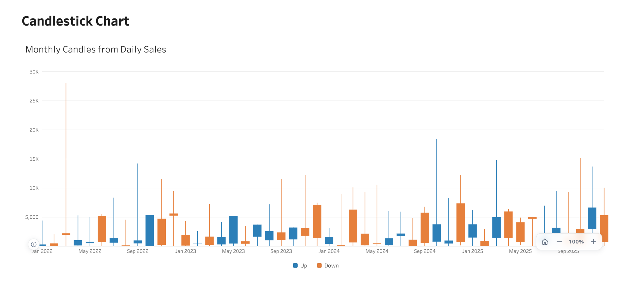
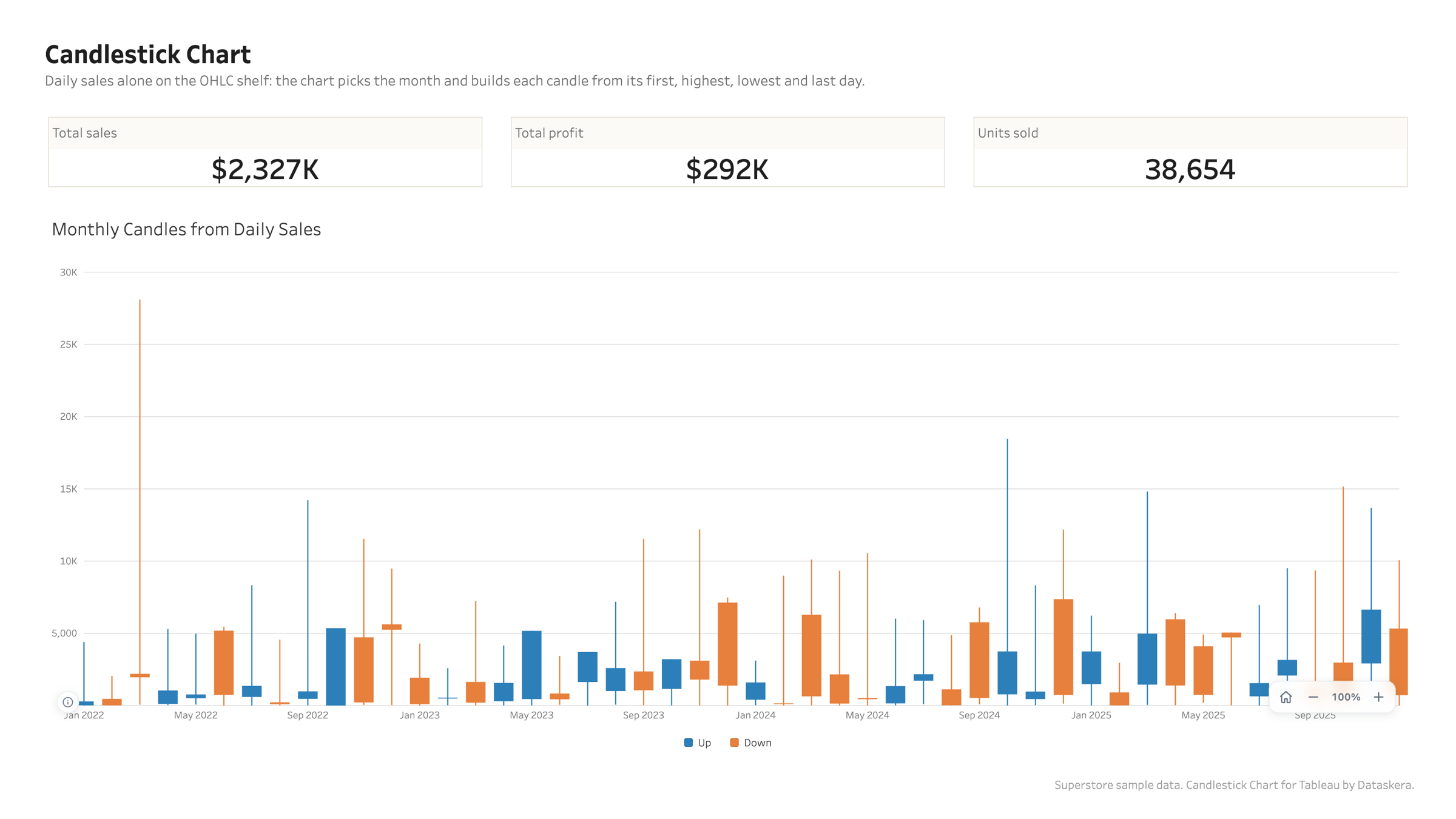
Candlestick Chart
Open, high, low and close over time, with an optional volume panel and moving average. For prices, and for any series tracked as first, peak, trough and last.
Overview
Four measures, or just one
Drop open, high, low and close on the OHLC shelf, or a single measure: the chart then builds each candle from the first, highest, lowest and last value per day, week or month, choosing the period that keeps the candles readable.
Four measures, or just one
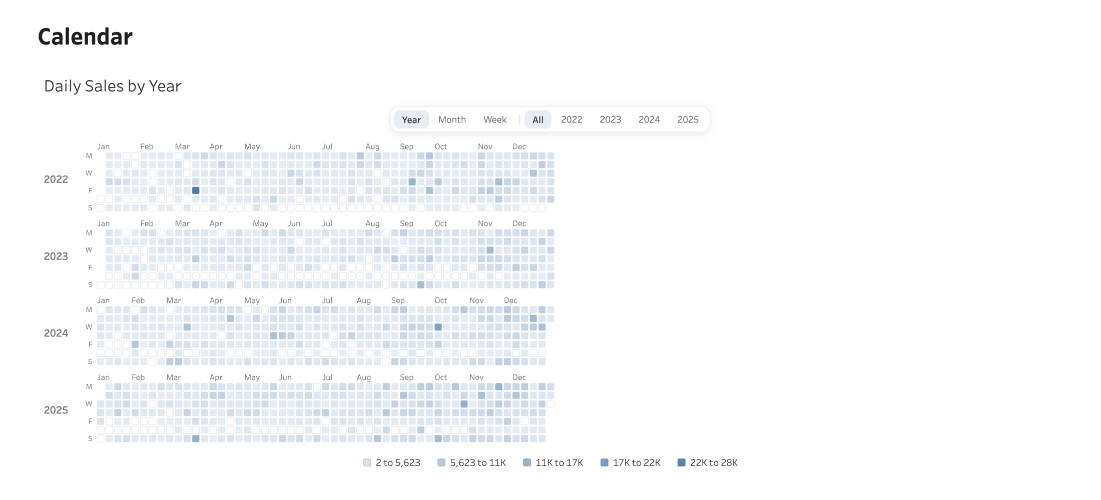
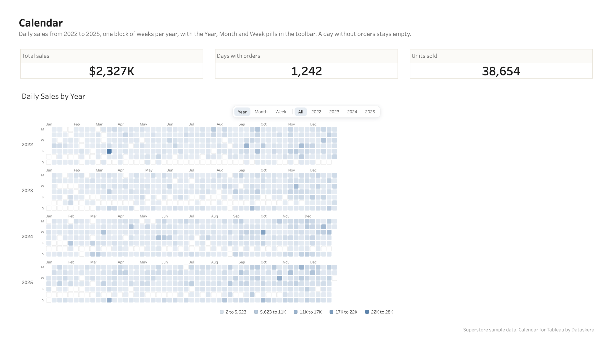
Calendar
A year, a month or a week of days, each cell carrying color and value. A day with no data stays visibly empty: null is not zero.
Overview
Three views the reader owns
Year, Month and Week pills sit in the toolbar, a month label in the year view opens that month, a week number opens that week. The View setting is only the page the calendar opens on.
Three views the reader owns
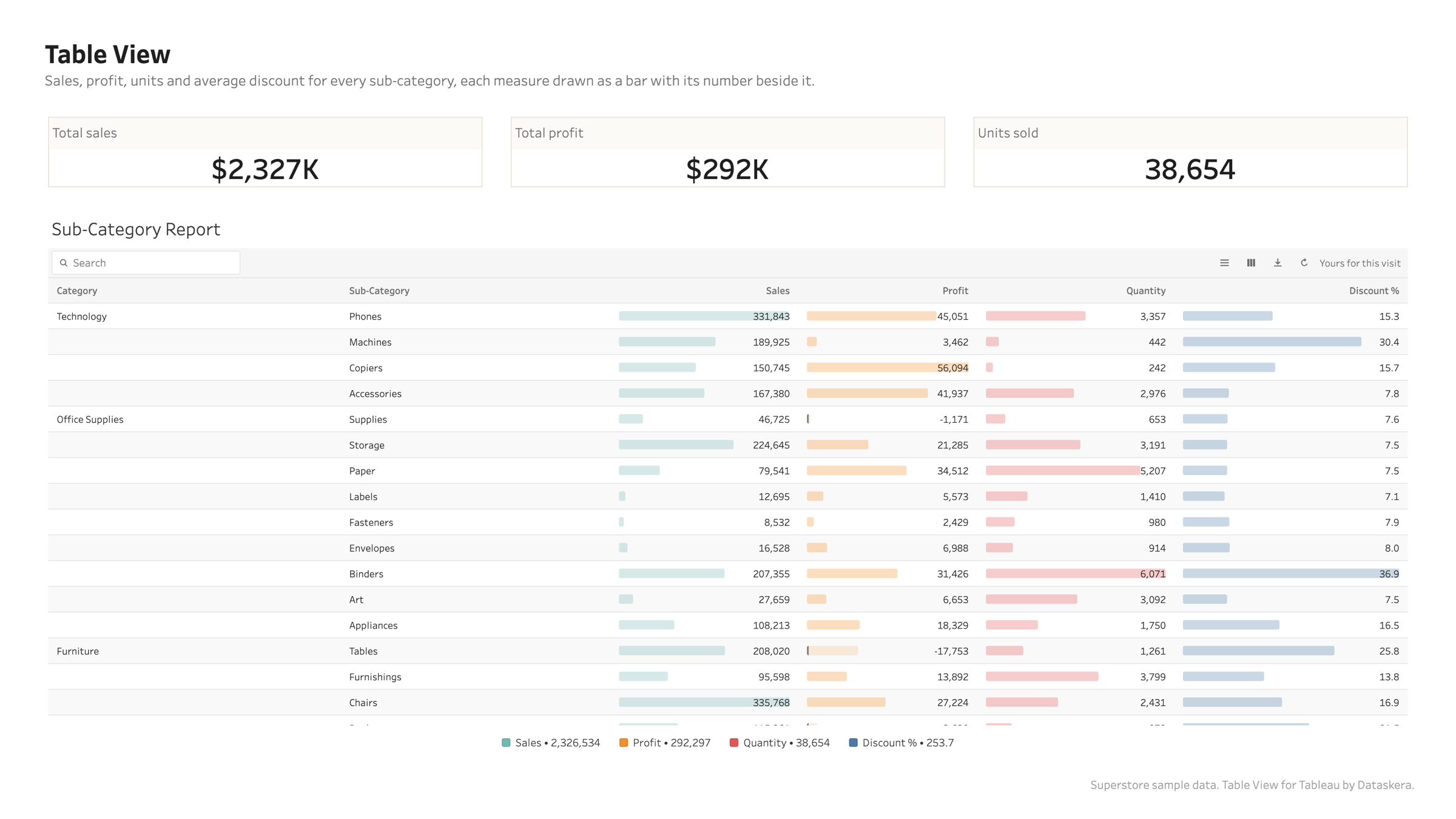
Table View
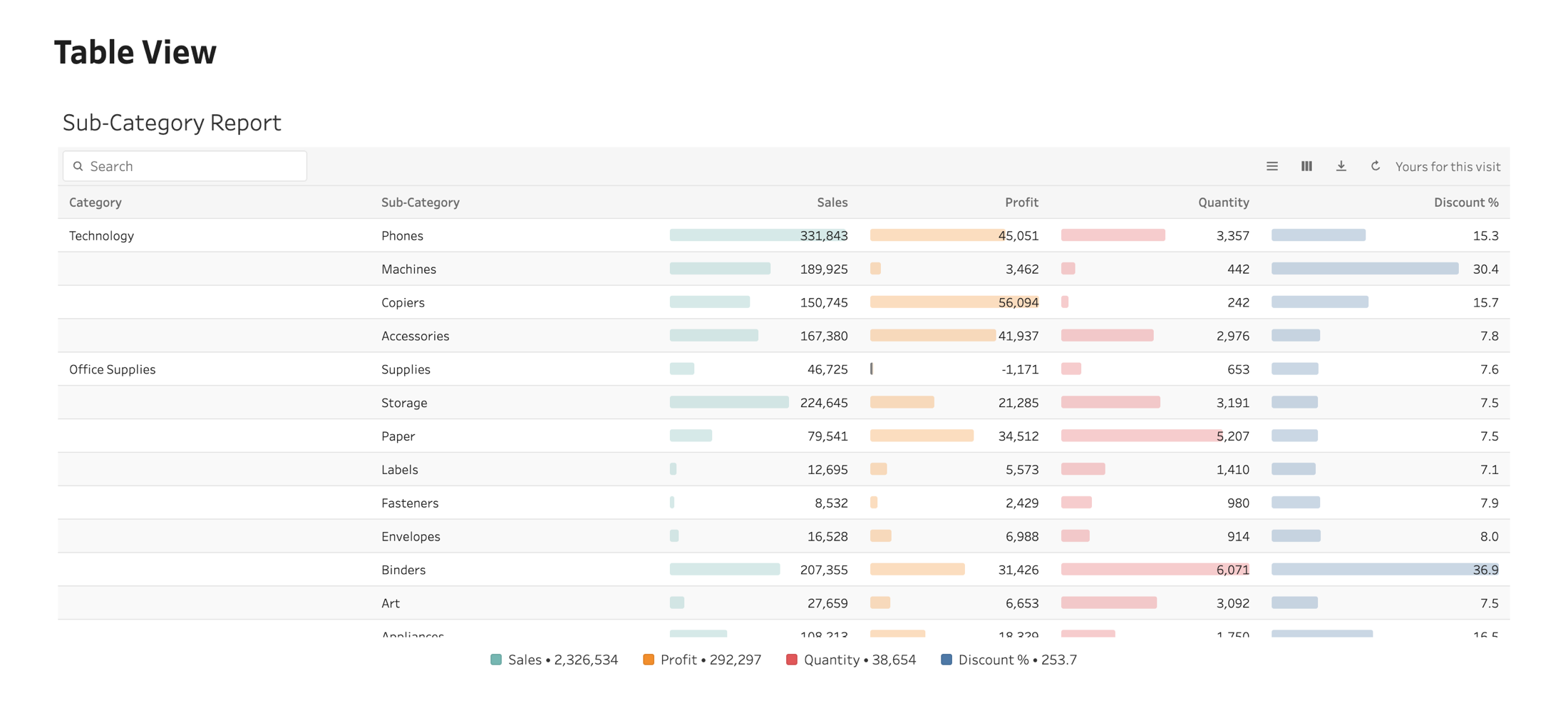
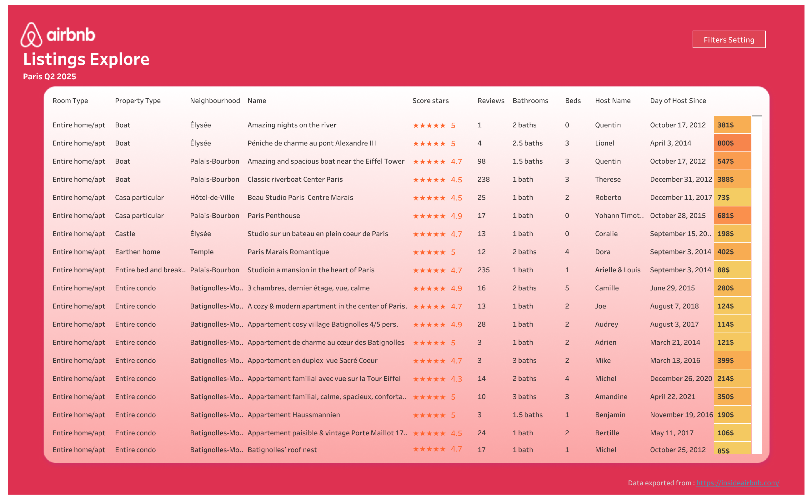
A table that reads like a report, with every column formatted on its own terms.
Overview
Bars and numbers, from the start
The shape is what a reader compares, the number is what they quote, so a column shows both by default. Up to 25 dimensions and 40 measures on one table.
Bars and numbers, from the start
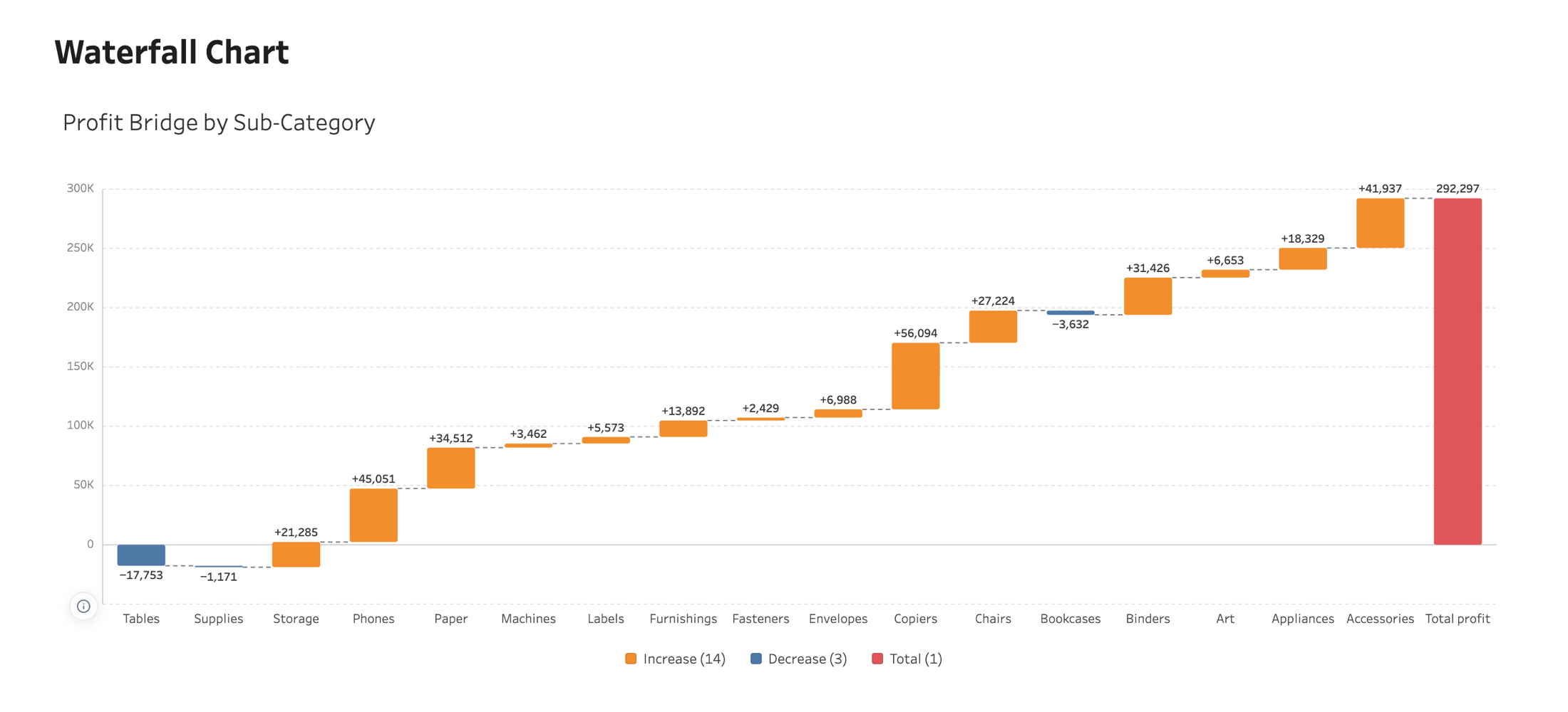
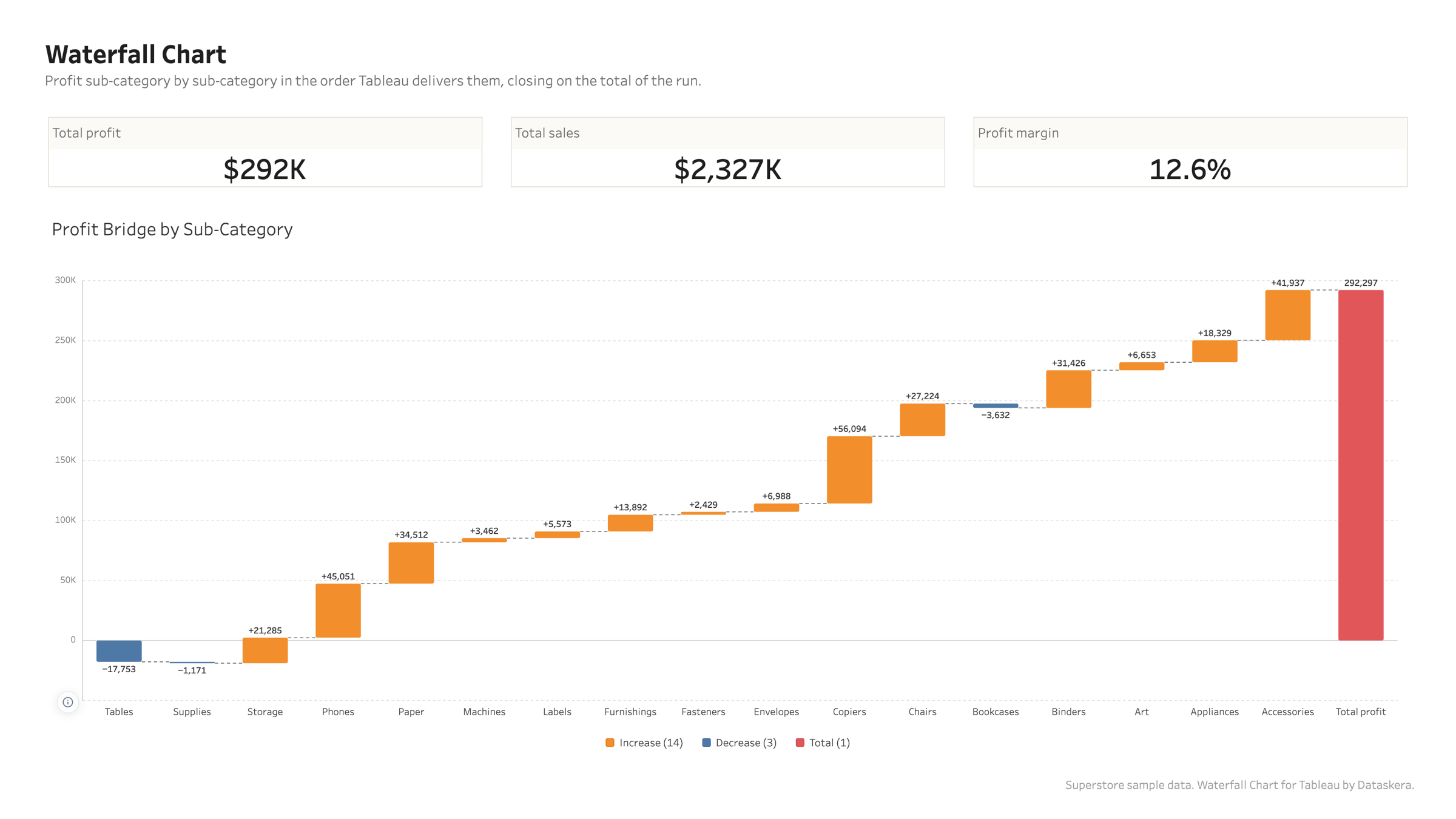
Waterfall Chart
A starting value, a run of changes, an ending value, with the arithmetic on show.
Overview
Built for a bridge
Steps stay in the order Tableau delivers them, because a waterfall is a narrative and sorting by size would tell a different one. Opening and closing bars are one click away.
Built for a bridge
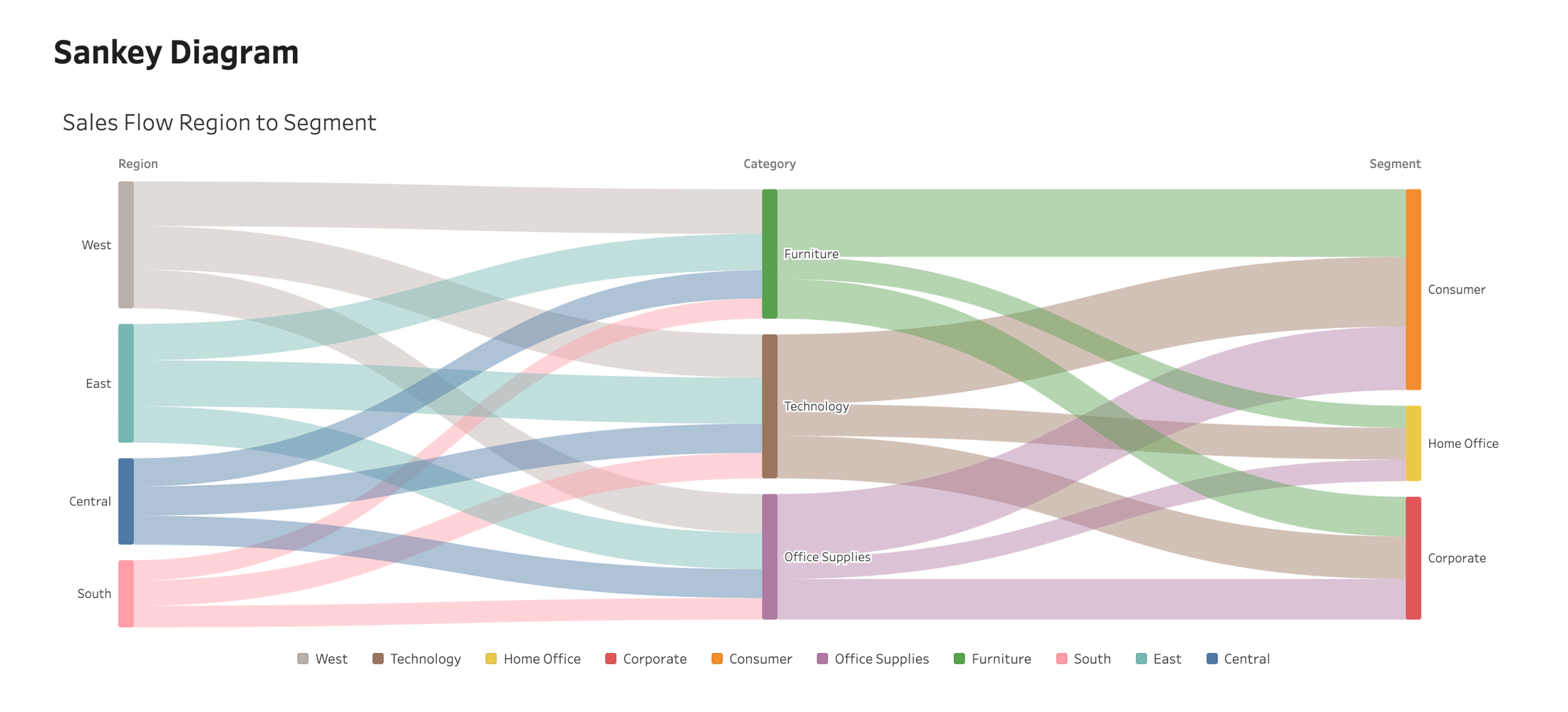
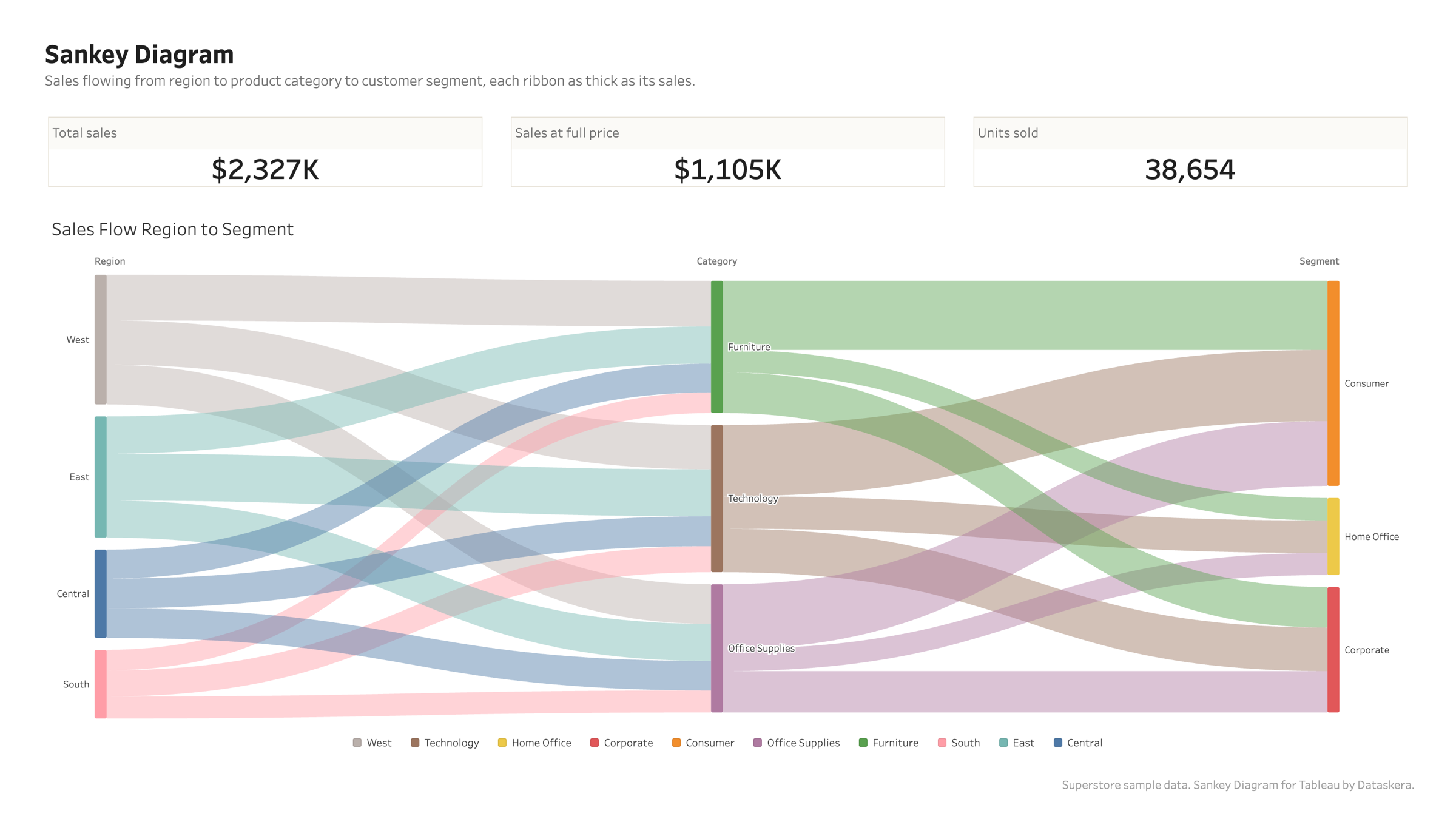
Sankey Diagram
Follow a quantity as it splits and merges from one stage to the next, and see where the flow stops.
Overview
Two stages or five
Drop the dimensions on Levels in the order the flow runs. Two levels give a plain source to target diagram, five give a full path through your data.
Two stages or five
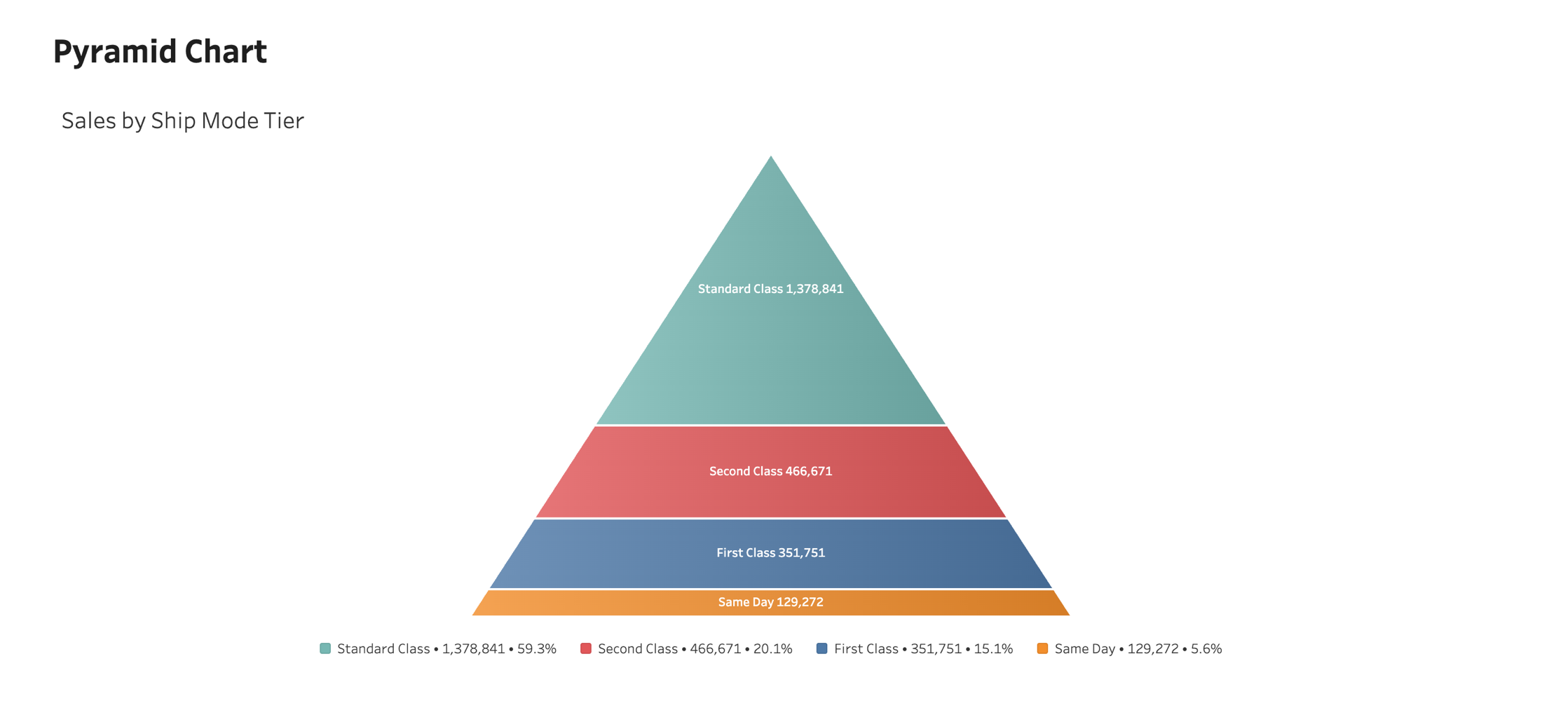
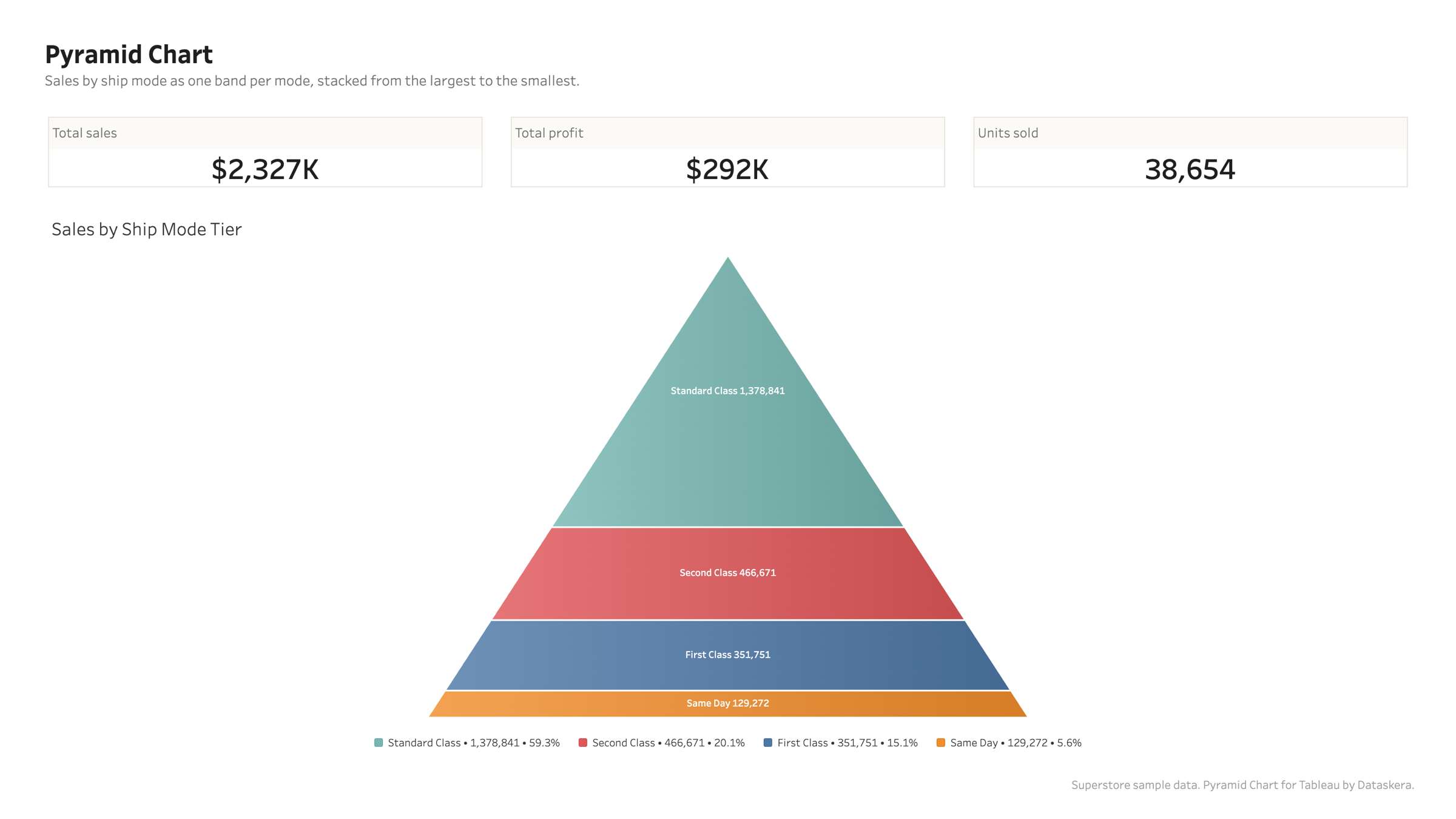
Pyramid Chart
Stages stacked from the widest to the narrowest, so a funnel reads as a shape.
Overview
Made for a funnel
Each band carries its stage and its value, and the conversion from one stage to the next is one placeholder away in the tooltip and in the labels.
Made for a funnel
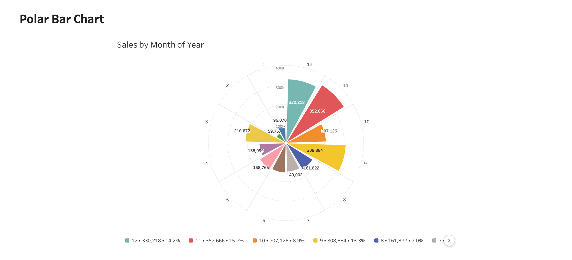
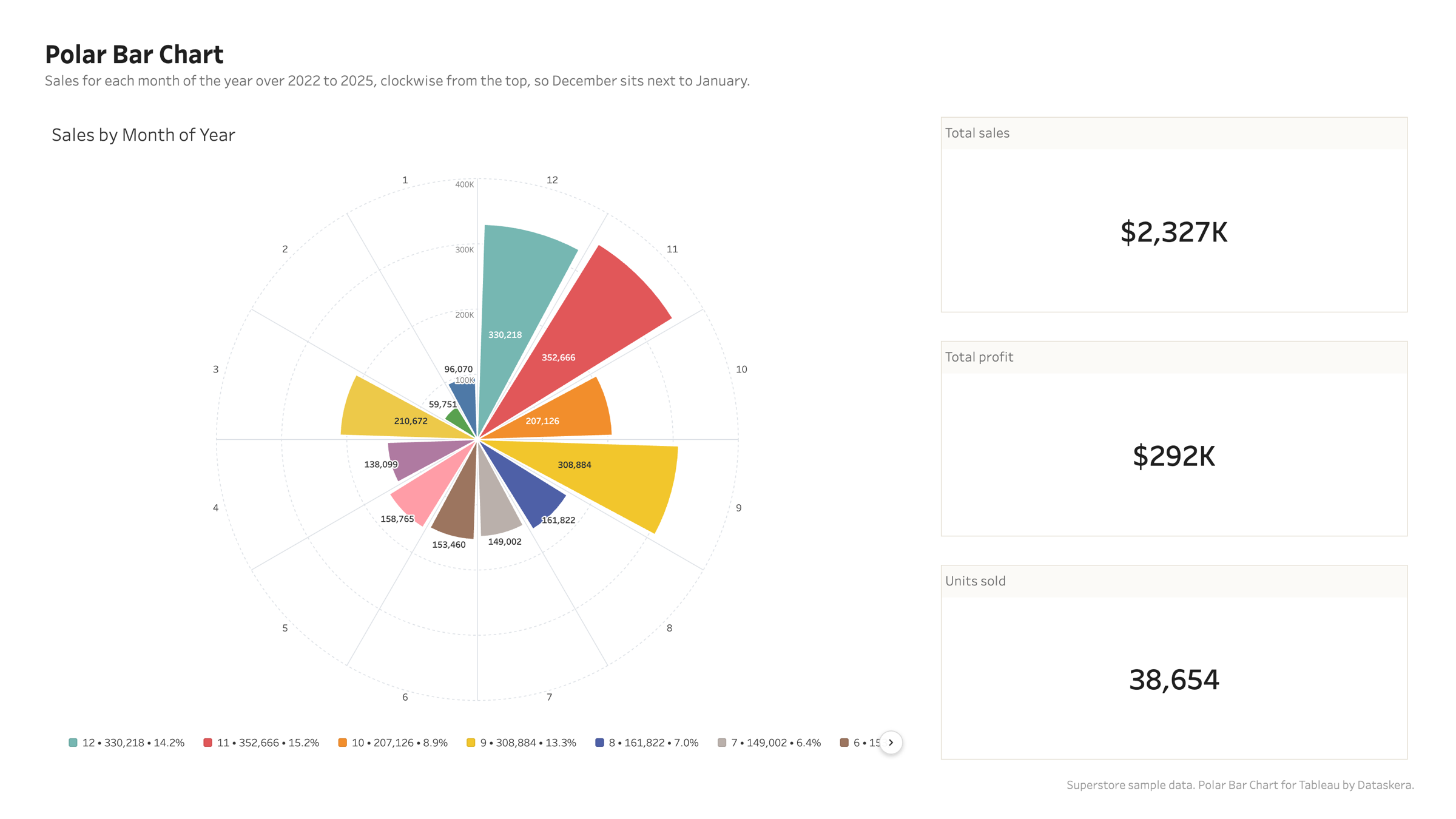
Polar Bar Chart
Bars laid out around a circle, so a cyclical pattern reads as a shape instead of a row.
Overview
Built for cycles
Sales by hour, incidents by weekday, wind by direction. The first and the last category sit next to each other, which is where the pattern usually is.
Built for cycles
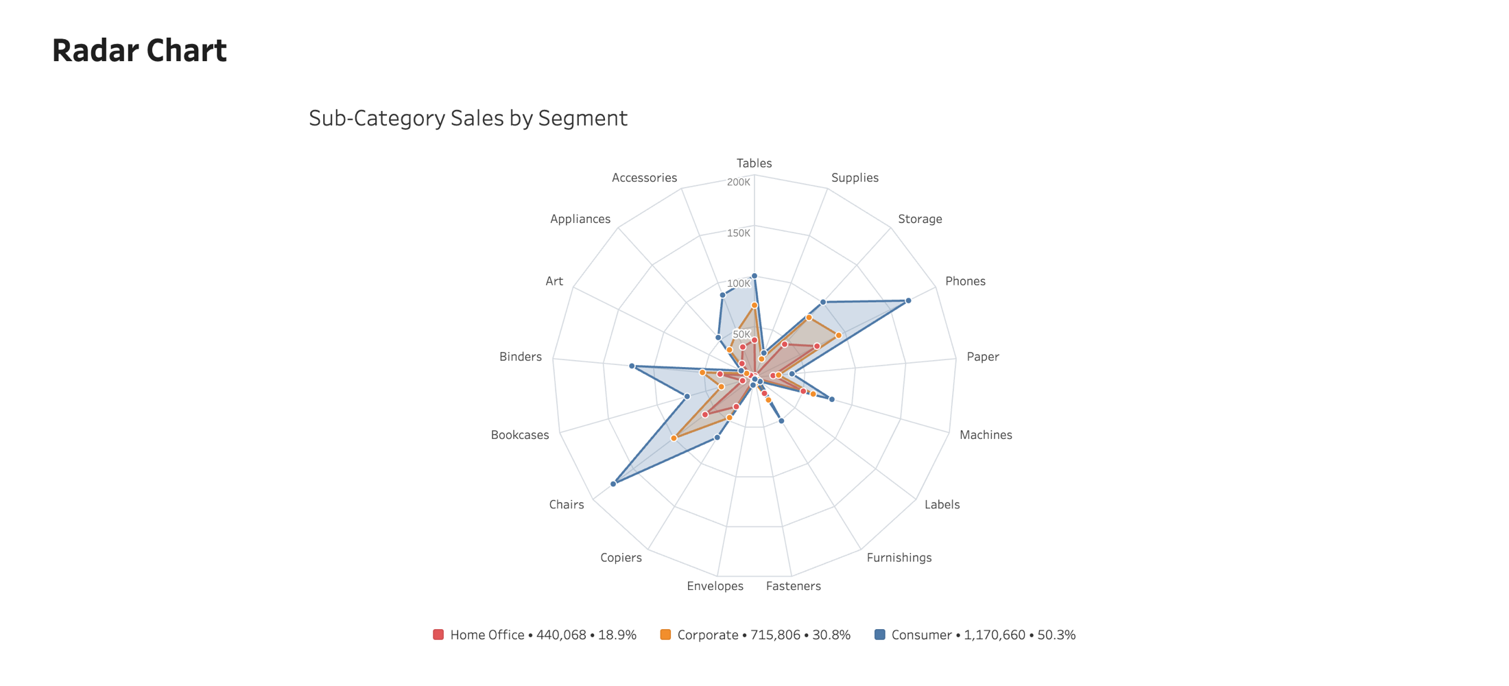
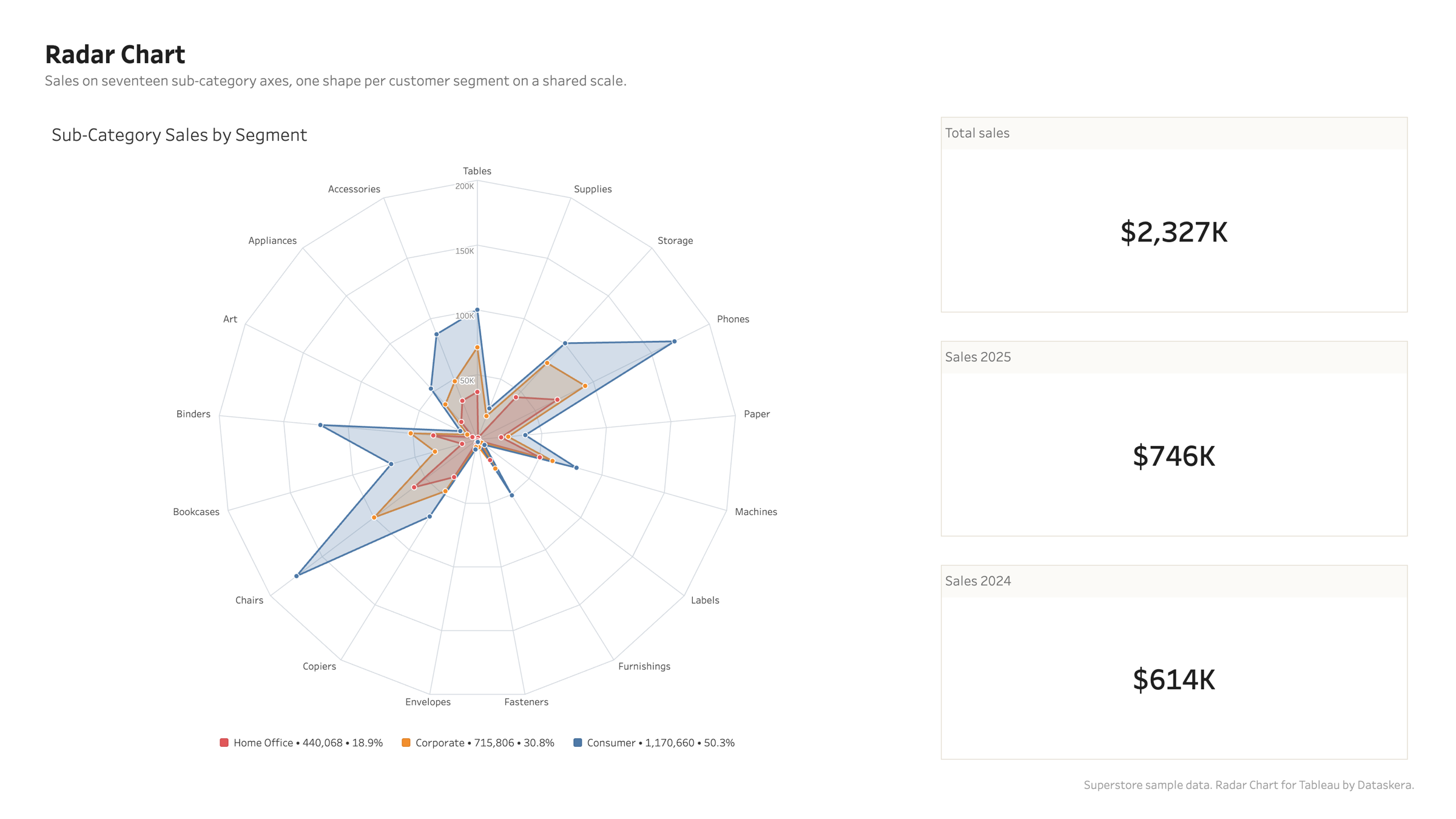
Radar Chart
Compare several measures, or several series across the same axes, on one circular grid.
Overview
One shape per series
Drop several measures for one series each, or a single measure with a dimension for one shape per value. Both shapes of data draw the same chart.
One shape per series
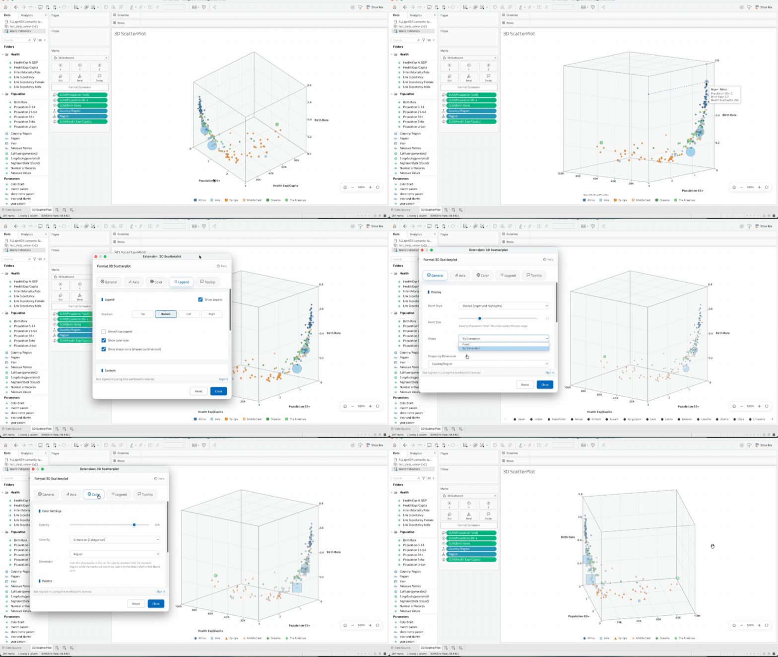
3D Scatter Plot
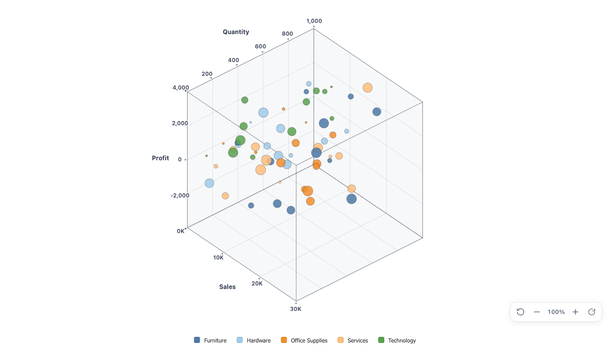
See three measures at once. The 3D Scatter Plot places your points in a real 3D axis box that you rotate and zoom inside your dashboard, with color and shape by category and an optional size measure.
Overview
Three measures, one picture
Drag measures to X, Y, and Z, and the axis box renders and scales on its own, with round-value ticks and smart K, M, and B units on every axis. Add a fourth measure to Size, and a dimension on the Detail shelf to color the points by category. With only two measures in play, it renders a classic 2D scatterplot automatically.
Three measures, one picture

Support you can count on · Our experts are available whenever you need help, while we maintain and update your extensions for optimal performance.

support@dataskera.com

Built by data analysts, for data analysts

Modern data-visualization extensions built on proven best practices to make complex insights instantly clear and easy to act on.

Innovative and customizable

Create visualizations that stand out, with flexible customization options that adapt to your users, dashboards, and data stories.

Stable and high-performing

Our data-visualization extensions deliver reliable performance and smooth operation, backed by our IT team’s expertise to ensure stability at every scale.

Expertise

From data to decisions.

Extensions, training, and consulting: one clear path from your data to your decisions.

Tableau Products

Visualization Extensions, Dashboard Extensions, and Accelerators to enrich your Tableau dashboards

  • Innovative Viz Extensions
  • Dashboard Extensions
  • Business Accelerators
Learn more

Training

Comprehensive Tableau training, in-person or remote, for all levels

  • Tableau Desktop
  • Tableau Server/Cloud
  • Tableau Prep
Explore training

Consulting

Personalized support on Tableau and Data strategy for your enterprise projects

  • Tableau Architecture
  • Data Viz Strategy
  • Audit & Optimization
Explore consulting